- Joined
- Sep 2, 2003
- Messages
- 34,503
- Reaction score
- 7,531
- Location
- In the mental ward of this forum
- Can others edit my Photos
- Photos NOT OK to edit
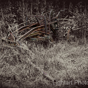
Over the weekend, I made a few test prints from my recent shoot of an abandoned gar repair garage.
I really liked this empty storage room in the back. It was very dim in there and I liked the light from the window and the empty shelves.
Tried more dual toning, this time leading with copper toner, followed by a brief dip in blue. The concept is to have the high and mid tones convert first, then the shadow tones convert with the blue. So the trick is to play with the time allowed in the first toner, since if you leave it in too long, there is no more silver left to convert with the second toner. I used Fotospeed toners.
Here is a progression of times:
Started with copper, 20 seconds, then blue, about 5 seconds. The copper tone here is light, almost peach colored:

This one is copper, 30 seconds, then blue, about 7 seconds. The copper is more pronounced, though still on the light side, and the blues are effectively distributed in the shadows:

I then decided to go for a straight copper look. No blue toner was added. This was toned about 45-50 seconds. Note the increased contrast in the print.

I really like dual toning, but I've learned to start with a ton of prints, since the times can vary and it's easy to go overboard one way or the other. My trashcan was my friend for this session. :mrgreen:
Thanks for looking!")
I really liked this empty storage room in the back. It was very dim in there and I liked the light from the window and the empty shelves.
Tried more dual toning, this time leading with copper toner, followed by a brief dip in blue. The concept is to have the high and mid tones convert first, then the shadow tones convert with the blue. So the trick is to play with the time allowed in the first toner, since if you leave it in too long, there is no more silver left to convert with the second toner. I used Fotospeed toners.
Here is a progression of times:
Started with copper, 20 seconds, then blue, about 5 seconds. The copper tone here is light, almost peach colored:
This one is copper, 30 seconds, then blue, about 7 seconds. The copper is more pronounced, though still on the light side, and the blues are effectively distributed in the shadows:
I then decided to go for a straight copper look. No blue toner was added. This was toned about 45-50 seconds. Note the increased contrast in the print.
I really like dual toning, but I've learned to start with a ton of prints, since the times can vary and it's easy to go overboard one way or the other. My trashcan was my friend for this session. :mrgreen:
Thanks for looking!
![[No title]](/data/xfmg/thumbnail/36/36673-19735e6d336c221f19091dde4a33c534.jpg?1619737676)

![[No title]](/data/xfmg/thumbnail/37/37606-3c9ffb5906173fa2aa489341967e1468.jpg?1619738148)
![[No title]](/data/xfmg/thumbnail/37/37101-cf094d75976427b415711e9c9955c8a3.jpg?1619737881)
![[No title]](/data/xfmg/thumbnail/36/36671-ba19a0fe0bbdae492df3a43fbee5497c.jpg?1619737676)