edit this one please!! x

jemmy

TPF Noob!
Joined
Apr 17, 2006
Messages
847
Reaction score
0
Location
queensland, australia
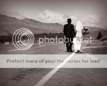
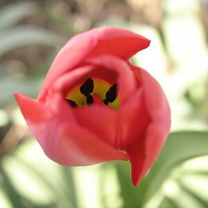
Hi all. I have posted this pic before but in the wedding/portrait section. I have been working on a stack of different edits but still am not satisfied. It was one of my favourites but now i am stuck!!! If anyone would like to give an edit a shot and tell me EXACTLY how you did it, I would be appreciative beyond words:lmao:

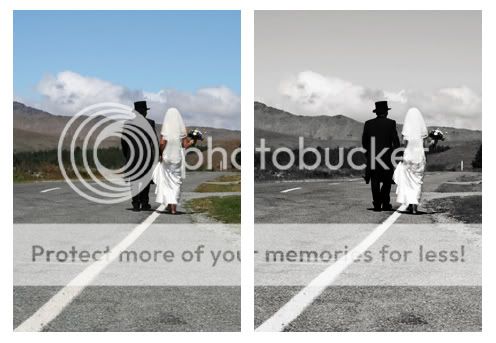
here it is converted to b&w with vignette but it is seriously lacking something???
hayley5.jpg


bucknerx.jpg


Thanks in advance... Cant wait to see your work x
 
1. Lab colour, delete channel b and alpha 2
2. Change back to RGB by going through greyscale
3. Play around with the burn and dodge tool
4. Add a vignette with a seperate layer, with the black paint bucket tool on it. Add a marque tool with the feather to 30 (on this small of am image) delete centre area and reduce layer opacity
5. Merge
6. Add some hint of colour by using either hue/saturation or colour balance.

The vignette is actually a little too deep in the sky for my tastes on this one, and I obviously missed a spot on one of the centre lines - which draws the attention away from them. Sweet shot though :)
bucknerx.jpg
 
nice edit peanuts...

Jemmy i didnt process these much, i just wanted to play with the crop... and i quite liked the idea of emphasizing the white line in the composition... so just something for you to consider...

bucknerxcopy.jpg
 
Since your inbox is full, I'll reply to your PM here to make sure you get it.

I really like your shot, and I saw a lot of potential in it. What I did was simple. You can download a .tif with layers to see what I did. It's here.

Basically, the first thing I noticed was that your shot was very flat, and lacking in contrast. That's the #1 reason why your colors were not saturated. A polarizer would help this, but also it has to be done with processing.

You'll see a levels layer. I basically brought the shadow slider way in, and the highlights in a bit. On the mask, I made a light gradient from white at the top to a gray at the bottom. This basically reduces the opacity of the levels smoothly down the image. I masked off the people, because I wanted to retain shadow detail in them. Next, I boosted the colors using a Selective Color adjustment layer. Basically you get channels for ever color, and you can influence the colors that make up that color. I use this to add saturation. You can double click on it and see what I did.

The topmost layer is a 50% grey soft light layer, which I dodged and burned on. I used this to exagerrate the details on the couple, as well as the details in the mountains and clouds. There's also a black and white group in there that you can turn on and see if you like. That's basically the background layer inverted, set to "color" blend mode, and a channel mixer adjustment layer, monochrome, and 100% blue.

That's it, with the crop which is also important I think. The edge of the road comes in from the bottom right corner, and the white line from the bottom left, and both lead right to the couple.
 
That's a small price to pay for a good shot. (insert smiley here) To me it seems weird that they are on the side if the road. Kind of like they are hitchhiking or their car broke down. If think the road should play a bigger role in the shot. I think you could have safely timed it. Does not look like an interstate. Of course I have no idea because I was not there.
 

Most reactions

New Topics

Back
Top