emerson

NMLeakway

TPF Noob!
Joined
Aug 18, 2005
Messages
335
Reaction score
6
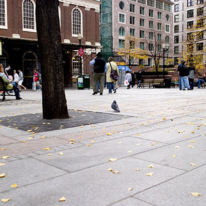
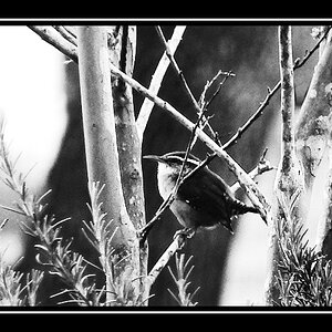
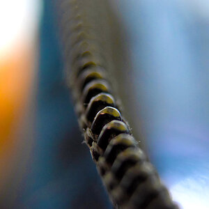
I never get any responses in the general gallery, so I thought I'd try for some suggestions here. Im looking to improve a lot of things, I'm very new to digital photography. How could I possibly improve this in photoshop? Are the tones and contrast OK? or are they too harsh? Be rough if you need to, I just want to improve.

emerson12.jpg


Thanks
 
The eye naturally tends to go to the light parts of the image, which is the left side, but the text is in the dark. My eye flicks to the blank page, then to the text, which I can't really see, and then gets bored. It's one of the ways I use to judge an image. Are my eyes led around to the various points, finding a lot to do, or do they get lost or fall off the page?

I'd play with the tone and contrast more so that the text is more legible, and you might also be able to pull some texture out of the page. It would give the eye something to work on. The page divide is also right down the center. I'd crop out some of the blankness on the left.

You could also play with ways to have the light fall on the book. The way you have it now it is picking up some of the paper texture, which is cool, and I like the angle. Perhaps something like an old piece of glass or something else to give the light itself some texture.

Here's an idea using the current image:

emerson12-mod.jpg
 

Most reactions

New Topics

Back
Top