Engagement photos

bunny99123

TPF Noob!
Joined
Apr 24, 2012
Messages
771
Reaction score
110
Location
Sherwood, AR
Can others edit my Photos
Photos OK to edit
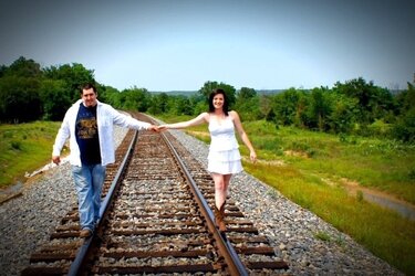
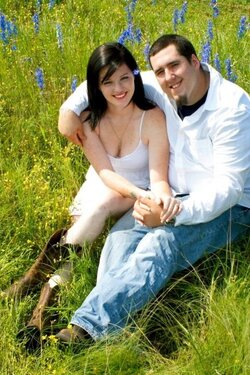
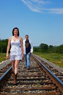
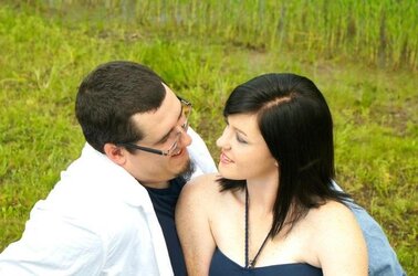
These are natural light of my cousin's engagement shots. C & C very much welcomed:)
 

Attachments

  • $image-654942134.jpg
    $image-654942134.jpg
    51.3 KB · Views: 148
  • $image-17557654.jpg
    $image-17557654.jpg
    105.3 KB · Views: 143
  • $image-2496340084.jpg
    $image-2496340084.jpg
    130.2 KB · Views: 164
  • $image-2202135255.jpg
    $image-2202135255.jpg
    79.6 KB · Views: 149
  • $image-4176413184.jpg
    $image-4176413184.jpg
    129.1 KB · Views: 154
  • $image-3888172106.jpg
    $image-3888172106.jpg
    90.2 KB · Views: 136
  • $image-4139441301.jpg
    $image-4139441301.jpg
    59.7 KB · Views: 137
I like them, especially the use of the railway tracks; very appropriate for an engagement. 2, 3, 4 and 6 are the best (imho) but I'd lose the vignetting in 2 and maybe play around with different crops on 2 and 4 to see what has the most impact. :thumbup: :)
 
Overall, I like the compositions, except the one with the vignette - I think nearly centering her and putting all the negative space on the right half of the photo was a mistake, especially with the slight curve of the track going to the left behind them. I think centering them on this one would be a good thing, with each of them occupying the left and right "thirds" lines of the composition. The vignette itself seems too strong to me also. I like to use them, but more subtle is usually better - if it's so strong that we immediate start thinking about it, it's taking our attention away from the subject, and that's not good. The photo should be about the subject, not about the processing.

Beyond the compositions themselves though, I think there are several issues you'll want to consider addressing.

First, you've got some overexposure issues with blown out whites on them that I think would be good to deal with. If these are already blown in the RAW files and there's no saving them, at least be thinking about it on future shoots. In conjunction with that, I think the contrast is just a tad too much for this genre of photography. The darks go to black just a little too quickly and lose detail. Combined with the blown out whites - it's just too much, I think. Light and airy, even somewhat diffused, is more the order of the day and certainly the current style for engagement photos.

DOF could have been much better exploited to separate them from their backgrounds and draw attention to the lovely couple.

These all appear to be in need of some post process sharpening.

Her attire is appropriate for a fun shoot like this. His T-shirt with writing and advertising is not, and it's unfortunate in a couple shots where his white shirt is hanging open to reveal it.
 
Thank you for the comments. I will reduce the vignette, see how that works. Granddad, I am going to try different crops. I liked her clothing, but wasn't fond of his. It is their pics though, and I make some suggestions, but left it up to them to decide. He is a steal worker, and to even get these shots is amazing. He can not stand his picture taken, and he claims he only takes his hat of for one thing. Thanks, Buckster for the suggestions. I have seriously, got to practice more on using raw. I haven't shot much in it, but have the software for it. I have so many people wanting me for photos, and I am turning them down except for people I know right now. I am so overwhelmed trying to learn so much at once, feel like I am in college again. I know I need more and more practice! I did these pics as a gift to them. Took around 200 shoots, so I have them in several settings many angles. Even got the train coming down the track, so I can stitch it to one of their track shoots. I appreciate any help, I can get :)
 
Just one additional point to add to the excellent points already raised. When using railroad tracks as leading lines, ensure that the subjects are at the vanishing point and not in front of it. 5255 is a perfect example of leading-line composition; the lines start in exactly the right place in the bottom of the frame and each line takes us to an element of the subject. 7654 and 2106 (In future, please number your images! ;) ) have the subjects in front of the vanishing point, which means that the lines try and take our eye past the subjects.
 
Blurring the backgrounds with a shallow focal point would put more attention on the couple. Nice scenerary though!
 
Thanks everyone! I will number photos next time.
 
Nice scenery and nice colors but honestly the cropping is wrong just about every photo. I believe cropping is the very first step in a great photo. It is what creates the environment and creates a sense of dramatic to each and every photo.

For instance

Below is a very dramatic crop to show the guitars in the background with the subject in the corner.

418395_3661497822082_1413796338_33587041_643700184_n.jpg
 
Nice scenery and nice colors but honestly the cropping is wrong just about every photo. I believe cropping is the very first step in a great photo. It is what creates the&nbsp;environment and creates a sense of dramatic to each and every photo.&nbsp;<br><br>For instance <br><br>Below is a very dramatic crop to show the guitars in the background with the subject in the corner. <br><br>
418395_3661497822082_1413796338_33587041_643700184_n.jpg
<br><br>&nbsp;
 
I think a great trick is to crop the subject in a way that they are cropped within the picture. The example I used above, I cropped his head within the guitars, the guitars are cropped by the box they are in all in the same way by sort of spiraling outward from the corner. I am mad at my self for not getting the corner of the guitar case to yet again have another "layer" of crops.

But you can use anything to crop a photo within a photo. The best and easiest example is a person in a doorway.
 
Honestly I cringe when I see people use train tracks for portraits. Reminds me too much of senior photos. But colors and sharpness are good. Framing could use some work as suggested.
 
DiskoJoe-glad I'm not the only anti train track person. They have become a pretty major cliché, to the point that I've seen children sessions done on train tracks, which just seems like a bad idea.

With that out of the way, the photos are nice, and the couple is very cute. The first is by far my favorite. The others could benefit from a shallower DOF and being shot either earlier or later in the day-these look like they were shot midday, and the light is very contrasty, with some of the highlights blown out. As far as posing and a guy that doesn't like having his photo taken, I will often find a doorway, bench or other good scene to frame the couple, have them sit there and interact, and then shoot from a ways back with my 70-200.
 
I love the guitar shot and can see what you are showing. These where taken mid day and in a rush. I had to drive over 200 miles to take two different shoots. I am not familiar with the area, so had to depend upon my cousin to choose the places. They wanted railroad tracks and fields. The couple loves nature. I am going to rework the photos, and try some crops as you all suggested. I have a problem I can't customers to get past that a person looks better not focused in the middle of the frame. Most photo experience from years ago portrait shots. I crop all different ways and the middle age on will mostly insist on the person being in the middle. Thanks everyone for your comments.
 
I love the guitar shot and can see what you are showing. These where taken mid day and in a rush. I had to drive over 200 miles to take two different shoots. I am not familiar with the area, so had to depend upon my cousin to choose the places. They wanted railroad tracks and fields. The couple loves nature. I am going to rework the photos, and try some crops as you all suggested. I have a problem I can't customers to get past that a person looks better not focused in the middle of the frame. Most photo experience from years ago portrait shots. I crop all different ways and the middle age on will mostly insist on the person being in the middle. Thanks everyone for your comments.

Personally speaking, while I recognise good advice about cropping, if the customer really wants to be in the middle of the photo, they can be in the middle of the photo. At the end of the day, clichés are in the eye of the beholder and if they really want train tracks they can have train tracks. Customers pay the bills and the customer is always right... Just thought I'd run that up the flagpole and see who salutes. ;)
 

Most reactions

Back
Top