Tyson
TPF Noob!
- Joined
- Nov 19, 2006
- Messages
- 652
- Reaction score
- 1
- Location
- Newark Ohio
- Website
- www.tls-photo.com
- Can others edit my Photos
- Photos NOT OK to edit
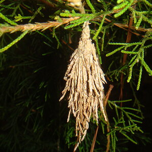
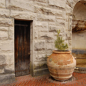
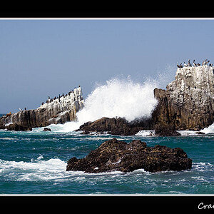
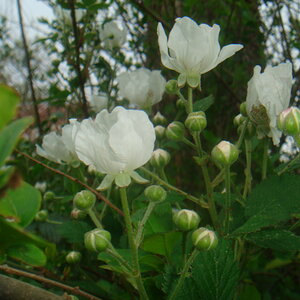
Ok now that I have you here, what do you thick of these shots?
Hardcore C&C let me wha tI did wrong or right.


Hardcore C&C let me wha tI did wrong or right.
 ).
).![[No title]](/data/xfmg/thumbnail/39/39443-45e1b162b6c7c1d8ebbc8faf5623b705.jpg?1619739034)
![[No title]](/data/xfmg/thumbnail/39/39447-6e7679723d775935851f055bae9712ba.jpg?1619739036)

![[No title]](/data/xfmg/thumbnail/41/41819-f9479f2ecfaf8e9491a13a92e02e640a.jpg?1619739903)

![[No title]](/data/xfmg/thumbnail/39/39182-efc21fe87c9b5f9b2fa9ab0f8f01c205.jpg?1619738903)