Fall colors and Philadelphia skyline

SkyscraperSunset

TPF Noob!
Joined
Oct 22, 2004
Messages
50
Reaction score
0
Location
Cherry Hill, NJ (Philadelphia)
Website
www.skyscrapersunset.com
I took this photo from my balcony at the peak of fall's color during the morning of November 3. Please let me know what you think.

balcony-fall.jpg


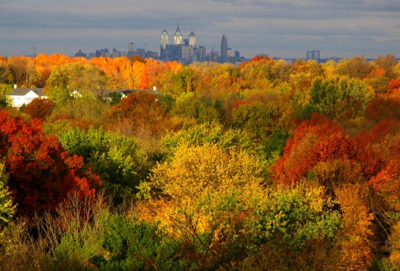
Do you prefer this crop?

balcony-fall-crop1.jpg


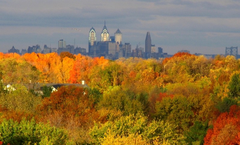
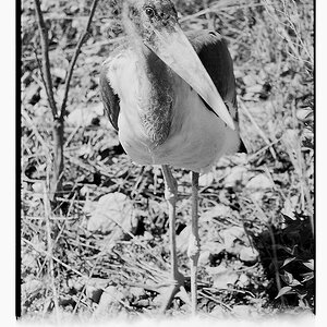
It's a shame I don't have a better zoom, because I'm losing resolution here, but look at the positioning of the birds:

balcony-fall-crop2.jpg


Thanks for any suggestions!
 
I just wanted to say that the color... :shock: I mean this is the best autum color pic I have seen during this autum. :shock: So much beautiful color. :D

Did I already mention color... :lol:

I like the first one best of these. Love it. :)
 
The color is awesome! These would make excelent Velvia shots IMO. It's just too bad about the houses in the lower left, a tad distracting.
 
Amazing color! #1 & 2 are best for me. Nice work! :thumbsup:
 
I think I prefer the first over the second. It has more reds in it than the second one, and those really make the pic stand out. Great job!
 
Love the colors (as does everyone else :D)

The 1st one is also the one I'd prefer! It adheres to the rule of thirds and makes for a more eye pleasing photo! Very nice work! Thanks for sharing!

Zach :D
 
Just beautiful! #1 is my favorite as well. Such rich colors :thumbsup:
 
My only crit is it needs a slight rotation counter clock wise. Otherwise, I really dig the first one. The crops are nice and I can see why you did them but the first shot leaves me staring into the city (if you know what I mean). Great work.
 
I like the first one out of the bunch. the only thing I would of like to see is more detail in the middle of the frame. Looks like the light was hitting there more then the fore or back ground from what I can tell of the house though. Any way, it is a good picture.
 
2Stupid2Duck said:
My only crit is it needs a slight rotation counter clock wise.
Thanks, you're right! Sometimes you kind of see that it needs that, then you're not sure, then you see it... Needs 0.3 degrees or so.

Geronimo said:
the only thing I would of like to see is more detail in the middle of the frame. Looks like the light was hitting there more then the fore or back ground from what I can tell of the house though..
I see what you mean. I bumped up the contrast a bit (8% maybe?) to make the colors stand out, and that bright area was my sacrifice. I think the photo's also having some .jpg compression trouble.

Thanks to you guys and everyone else for your critiques and compliments.
 

Most reactions

Back
Top