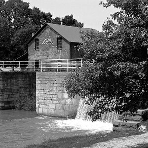
I recently shot these with ISO 100 film. Perhaps I didn't have enough light because they turned out kinda flat. I adjusted the hue and saturation in Photoshop but I'm not sure if it looks right. Please give me your opinion. Thanks
The 2nd one is nice. Great blues in the sky.
The 1st one has too much red in the lower 3rd portion of the shot. Maybe try and reduce that.
The 3rd one is pretty good. Maybe boost the blues for the sky and the water.
Great fall shots. So much colour this time of year! It's great.
A post of multiple photos is for the Galleries ... the Photo Critique is for some serious and specifically outlined critique desired on one particular photo. That is what can be read in the Critique Guidelines here .
That's interesting. I'm assuming you are talking about 1 and 3. I think you might be right. I left the lake in the picture because I thought it would look nice however that's not the case. I'm going to reshoot these with a different angle and a little less exposure.
Regarding the second shot, I tried a bit more blue in the sky and didn't like the results. Thanks everyone for the input.
I don't mind the intensity of the blue against the yellow foliage of that nicely shaped tree in 2, although it is bordering on viewcard colours.
I also like the composition of 1 quite a bit with the water starting at the lower righthand corner and spreading from there to the centre, leading the eye to the trees. Personally I might have liked to see some more of that water included and a little less of this blue-blue sky with the nice clouds ... they are nice, no doubt, but a narrower strip of them would have done well, too.


")


![[No title]](/data/xfmg/thumbnail/32/32926-ec27ecead8c80d803404500d8f888dbf.jpg?1619735754)
![[No title]](/data/xfmg/thumbnail/32/32929-22e23acc63d6ecb25e5ee941be87121f.jpg?1619735758)

![[No title]](/data/xfmg/thumbnail/32/32930-09414fc020c2a60a456ff59a05c5ef8f.jpg?1619735759)