Family Fall Session C&C please

CorrieMichael

No longer a newbie, moving up!
Joined
Sep 28, 2012
Messages
447
Reaction score
166
Location
Canada
Can others edit my Photos
Photos OK to edit
Playing around with some new pp as well would love some C&C on these please and thanks
1. $Arjen side by sidelogo.jpg2.$IMG_7953washdpidusklogo.jpg

****Also the first image looks as though it uploaded very cool, this is not the tone I see on my windows or ps*********
https://www.facebook.com/photo.php?...6482502.113671.466447043385681&type=1&theater <<<< here is a better view of the image
 
Last edited:
They're cute. 2 isn't doing much for me though. And I love 3 but admittedly, it makes me cringe a little. I always have minor inner heart attacks when people are holding babies by their arms like that.
 
C&C per req:

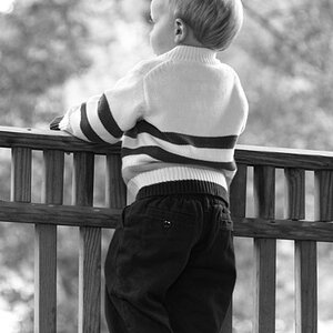
1. Great expression! My only real niggle here is that you've got great leading lines in the form of the bridge railings, butyour subject positioning isn't quite ideal. It would be perfect if you cropped away the LH railing, or had positioned the child such that he was at the vanishing point of both railings. Fortunately the LH railing isn't very prominent.

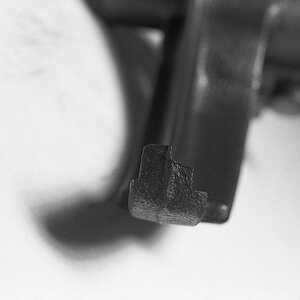
2. I don't like this one. In fact, to me, it has a slightly macabre look to it.

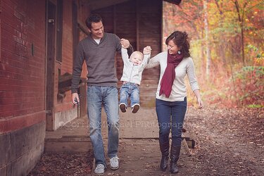
3. This is a GREAT shot! My only thoughts here are that I wish you had been able to compose it so that the vertical line of the wall was visually more over to the right, and I would also crop a bit off of the RH side to move them out of dead centre.

Overall, this is a good series, 'though I find your processing a bit dark for my taste, and I'm NOT a fan of the vignette, I think this is welle executed.

Just mY $00.02 worth - your mileage may vary.

~John


What? did you say "GREAT?" YAY! I think I might be getting somewhere! lol
 

Most reactions

New Topics

Back
Top