Family of Three

Peanuts

TPF Noob!
Joined
Jun 16, 2005
Messages
2,905
Reaction score
85
Location
Canada
Website
www.brittanyesther.com
Can others edit my Photos
Photos NOT OK to edit
Well, I finally did my first stranger studio shoot, actually, make that stranger shoot. I don't think I could have possibly had more creative and fun people to work with though. It was just a very relaxed and fun few hours.

I am looking for hard CC, though I will provide some of my own opinions. Especially on lighting and how it can be improved.

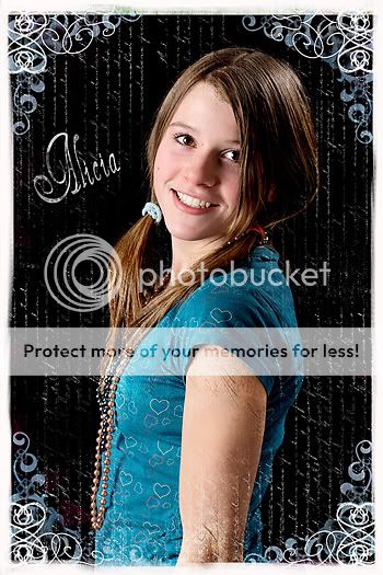
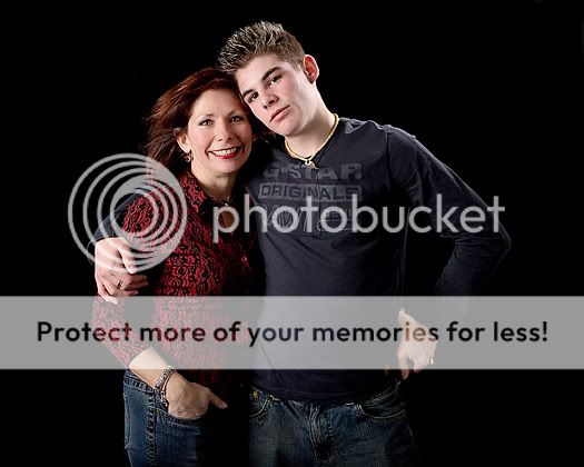
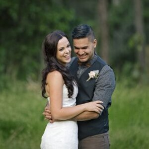
1. This one I think I could have worked on her positioning better. her body could have been turned more toward the camera so it wasn't practically a head on a completely linear body. Also, I should have asked her to move the hair away from her left eye. The blend is from Lisa Monistere - honestly, I can't wait to play with the blen/borders more. I am usually one to not use them, but I just love how they spice up an image.
ILPAliciaBlendsmall.jpg

2. How can I prevent the hard shadowing between them? I guess it would be a reflector near the floor pointing upwards and reflecting the left from the softbox on their right up? Does her hand look too awkward where his should be?
ILP_J8R4140.jpg

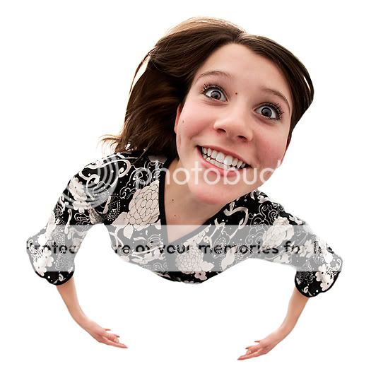
3. Here is the fun shot from the session. Who said fisheyes can't be in portraiture? :lol:
ILP_J8R4562crop.jpg

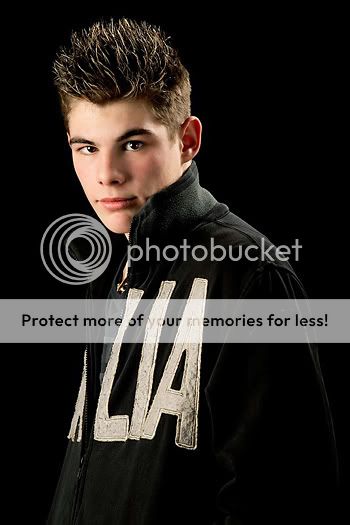
4. Now back to something a little more serious. I think the hairlight should have been positioned a little bit more behind him to prevent that line-like shadow across his left check and eye. Did I completely over do the skin softening? He has a fair deal of acne and the spill of the hairlight did not help! Oops.
ILP_J8R4167edit.jpg

5. Similar problem to 2
ILP_J8R4112-1.jpg

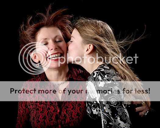
6. Probably my favourite. (Also, Lisa Monistere's blend)
ILPAliciaBlend2bw.jpg

Thanks for your time!
 
Thanks ShootHoops.

Anyone want to help on the lighting front or just plain old critique? :)
 
Well, sorry, Brittany, but I cannot help you with regards to lighting at all. I wouldn't know where to begin if I had to set up my own lights for anyone. All I ever did was play around with my desk lights and "Liesel" (search for "Liesel" if you want to :mrgreen: ) ... so no help. Sorry.

But I like what I see, and to know that you are younger than my son makes me look at these in awe! The mere fact that you are beginning to do studio shots for people who buy those photos ... wow.

Personally, I am not so in favour of the frames you went for in the first and last photo, though I do like the last photo as it is! And the fish-eye fun-portrait is ... yes: fun. Great fun. You can do it with a young face like hers and a nice, open, natural smile, and from the position you chose to do it. It works.

As to the photo of her brother: I really like how the light from the softbox shines right through his eye, lighting it up from within so we get to see his eyes' colour! I really like that effect on anyone's eyes any time I see it!

Maybe you would want these in Portraits and Weddings? You went "pro" with these, so that should be their place, and you would "meet" our experts such as DigitalMatt etc. What do you say?
 
Love the fun shot, hate the Monistere-things. Wish I could help you with lightning and such, but you're way ahead of me.


pascal
 
Peanuts – You are doing the work, and it shows.

1. Great expression, awkward pose, agree with your solution. Hair over the eye doesn’t bother me at all. Your photography is good enough to stand on its own, and doesn’t need that awful gimmicky distracting border stuff. It will just ruin your work. (Well, you asked for hard c&c!)

2. I’m not sure that a reflector would work to fill the shadow between them. It might, but seeing how his neck/ear is so hot, if you turn that lamp down it won’t help with that solution. Instead, why not keep things simple and bring a light around towards the front a little to fill the area between them? Yes, her hand looks awkward in her pocket and so does her other hand, IMO. Hands are wonderful things to show a connection. I know it’s not easy to position them, especially when the people are there waiting on you, the music is blaring, the modeling lamps are rattling and the fan is blowing, but it’s important. Tune everything else out, and visualize the photo you want. I always have a tough time with it. Which is why, when I study the masters, either in books or in museums (photography or painting or illustration), I’m always studying what they did with the hands.

4. Shadow across cheek is fine, doesn’t bother me, hairlight looks good. This is a great shot, only two quibbles. First, the other ear shouldn’t show at all. Having it show just a little like that is distracting. PS that puppy outta there. And second, clothing is distracting with the sports jacket (or whatever) with words on it.

5. Busy shirts take the eye away from the people and their expressions. I love this shot, but I’m distracted by the shirts and the fan. (and you can’t see the kisser’s lips/face enough, if we’re gonna get really picky)

6. Perhaps choose short lighting or broad lighting, but all that light bouncing around her face isn’t necessary. She’s got competing shadows.

Summary: look, I know these photos are supposed to look fun, and be fun. So I think you should tailor it to the intended purpose. But, my perspective is different, so please take it with a grain of salt. I'm more into the pure timeless quality of showing something about the subject. So I would like to see you lose the gimmicks, i.e. the blend border stuff and the fan, and use solid shirts. It’ll calm everything down a little and allow the viewer’s eye to concentrate on your subjects and who they are. Use simpler lighting. The girl in 6 only needs a softbox moved in close on one side, and then allow its wraparound light effect to just bathe her face in soft light. After that, it’s all posing and expression.

Finally, all portraits are self portraits, at least to some degree, since the subject is responding to the photographer, and that response is usually unique to that person. Even though I don't know you, I must say that it seems to me that your personality is coming through to these people and they're showing me their response to you. Keep that going. It's wonderful. It adds a valuable dimension to the images. :thumbup:
 
So sorry for not getting back to this earlier - one of those days.

Anyways, can't say just how much I appreciate the critique - especially on the blending/borders thing. I am still a little partial to it for younger individuals in tiny prints (4x6 or smaller), but I do need to hear what the majority of individuals are thinking on that front. (That being said, I should mention I haven't actually printed any of these and I have saved both versions with a no-border, so completely fixable :))

LaFoto - Oh believe me if you saw all the throw-aways you would be in considerably less of a state of 'awe'. Probably more along the lines of disgust. :lol:. Regarding the area it shoudl go under, it may be a little late now, but if you think it would be best in the Portraits and Weddings that would be just great.

Jazz - Thank you, thank you, thank you. That was precisely what I needed.

2.I really (exentuate that word) need to work on posing/positioning - for some reason I seem to overlook the obvious while behind the camera and when I put it up on the computer I ask myself how I could have missed it.

4. On the ear - will be PSing that one out of there. On the jacket, unfortunately he was quite adament about wearing his 'Italia' (I think that is it) jacket. I don't know if it is a new fad or what - but that was not coming off of him for his individual shots. To accomodate that I should have probably positioned him so you could actually read it as opposed to a random 'lia'

5. Defintely need to watch clothing more. The fan was defintely over done here - the more I look at it, the more I see a fleur-de-lys sprouting from her forward. Whoops!

6. Funny you mention the broad/short lighting. I hadn't even heard those terms until a few days ago and I have been reading up on studio portraiture for at least a month. That one I will have to read up on more.

Once again, I can't say how much I appreciate everyone taking the time to help me. :)
 
For some reason I actually really enjoy #3! Nice shots!
 
I agree with what Jazz had to say, the photos are great and the borders are hurting rather than helping. I know that it sometimes feels like an image needs a border or something like that...but I think that if/when you print it out and put it in a nice frame...it will be better off without the PS borders.

I think you did a great job and you are getting better all the time. You'll be rich in no time :D
 
I really like your pictures and I think the lighting is just fine. I think the borders are fun and suitable for the girls photos. I think that they would love them.

The only things I didn't like were on 1 under the girl's sleeve it looks like she has cuts on her arm. o_O Also on the bottom of her arm it looks like she kinda has toothpaste or something. It's probably just my weird mind at work. :p Also on 2 as you thought, the hand looks a little weird in that position on the guys side.

I love how the hair looks wispy and even the fun pictures look nice :)
 
Nurd - now that you mention it, it does look like cuts! Whoops, her mother wouldn't be very pleased with that. That is actually part of the blend, which I can get rid of (or just scrap the blend in total), but I had defintely entirely missed that one before.

Thanks for the comments everyone.
 

Most reactions

Back
Top