Family Portraits - CUTE KID!

FattyMcJ

TPF Noob!
Joined
Jan 29, 2010
Messages
780
Reaction score
29
Location
Colorado
Can others edit my Photos
Photos NOT OK to edit
Thought I'd share what I did this fine Colorado evening...

1)
5083315174_b629827097_z.jpg


2)
5082718985_c7f0f3ccc6_z.jpg

^ I really like this pose...it's feminine and attractive lol

3)
5082718641_59babc647f_z.jpg


4)
5082720399_9589cfe27f_z.jpg

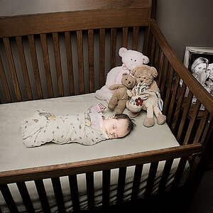
^Cutest lil guy you've ever seen. This shot was classic...I told mom and dad to step away for a while and he was all "hey...wtf?" lol

5)
5082719965_a7e72b5309_z.jpg

^They were a very cool, relaxed, and cute couple. Mid 20's and their son is 6mo. old.

Such a good experience with them today. Hopefully they enjoy the photos and tell their friends! :dance:

View all 32 Photos from the day HERE!

As always C&C is welcome and appreciated, every shoot is a learning experience!

This shoot...I forgot my umbrella's, and for half the shots (all in the garbage now) I'd forgotten to turn on the receiver to my NPT-04's "Why isn't your flash going off?" :roll:

Live and learn :lol:
 
Last edited:
Something is seriously wrong with your white balance. That kids head looks blue and the in the last photo the woman skin tone looks like she should be passed out. Ease on the PP and get correct WB for photos like these. These types of photos require a MINIMAL amount of PP; crop etc...
 
Alright, I looked through the rest of your set and your WB is way too cool. Warm it up a bit. You're at like 3000 when you should be more around 6500-7000. The composition, mood and framing all look good though.
 
Something is seriously wrong with your white balance. That kids head looks blue and the in the last photo the woman skin tone looks like she should be passed out. Ease on the PP and get correct WB for photos like these. These types of photos require a MINIMAL amount of PP; crop etc...

Alright, I looked through the rest of your set and your WB is way too cool. Warm it up a bit. You're at like 3000 when you should be more around 6500-7000. The composition, mood and framing all look good though.

It's not the white balance, it's what I did deliberately. She asked for the "retro-style muted colors" and the "angelic look" for her kid. Then again, maybe it's gone too far...Dell laptop FTL.

But I understand what you mean and I thank you for taking the time to comment :mrgreen:

I think in the future I will warm them up a bit, if even just for posting on Flickr or my personal tastes.

Yeah people don't seem to like to comment on here. Yeah you should warm them up, I don't think many people would enjoy the blueish look. Could you checkout my "birdcage" post below...?
 
Yeah people don't seem to like to comment on here. Yeah you should warm them up, I don't think many people would enjoy the blueish look. Could you checkout my "birdcage" post below...?

I've gotten plenty of replies when I post things, it may take a day or two, but people do look and if they feel it's worth commenting, they will. And it's late right now, so I never expect a reply inside of 12 hours usually. lol

I did look at your photos and I must say, the model and exposures are beautiful, but the hard-core fashion stuff isn't my taste.

Didn't warrent a comment?
 
Abit over the top with pp IMO
 
From what you've explained about the clients wishes you've nailed it. If they are paying, give them what they want :D
 
Something is seriously wrong with your white balance. That kids head looks blue and the in the last photo the woman skin tone looks like she should be passed out. Ease on the PP and get correct WB for photos like these. These types of photos require a MINIMAL amount of PP; crop etc...

Alright, I looked through the rest of your set and your WB is way too cool. Warm it up a bit. You're at like 3000 when you should be more around 6500-7000. The composition, mood and framing all look good though.

It's not the white balance, it's what I did deliberately. She asked for the "retro-style muted colors" and the "angelic look" for her kid. Then again, maybe it's gone too far...Dell laptop FTL.

But I understand what you mean and I thank you for taking the time to comment :mrgreen:

I think in the future I will warm them up a bit, if even just for posting on Flickr or my personal tastes.


The blue tone doesn't really say "retro". When I think retro PP, it's usually a warmer tone rather than cool.
 
I like your stuff, but on my monitor your white balance looks way off as others have said.. I mean if the clients love it then no problem, but I'd consider trying to fix the white balance if you shot in raw and showing them those, too.

I think also that the white border in 2 & 3 is throwing me off - a black border or no border (although probably your watermark?) may change my mind.
 
i like them all minus the first one
 
Dont shoot me k? lol:lol:

IMHO, the thick borders are overkill...:meh: and I also agree the blue tint is over powering. Some shots ( like #4 ) I think it looks a little too saturated.. colors are crazy bright. I dont really get the ' retro ' vibe from them... but its all about what *they* like and want... so if theyre happy then..:thumbup:

The composition is great though... and they are cute pics, im sure they're pleased.
 
Thanks for the comments guys!

I'll have to check them out on a different monitor to see just how bad this "blue hue" is. That might be the final nail in the coffin for my Dell, and the catalyst I need to get an iMac and a Pantone Colorimeter

As far as the borders, I hate borders too...but... these serve a purpose.

1) They allow the customer to crop the images however they like (8x10, 5x7) WITHOUT losing any of the "actual image", all they cut off is the border. This is done during the purchase phase on SmugMug where they select the size they want.

2)It cuts down on the PP work I have on my end by just uploading a full size 16x20 image with the border and I don't have to go in and resize each photo for each aspect ratio. 1 Photo for all sizes via the big border.

Useful on the business side, but not my "ideal" way to present images for C&C...my apologies.
 

Most reactions

Back
Top