I hope you're looking for CC. In a professional forum, I know CC is quite standard and part of the growing as an artist process.
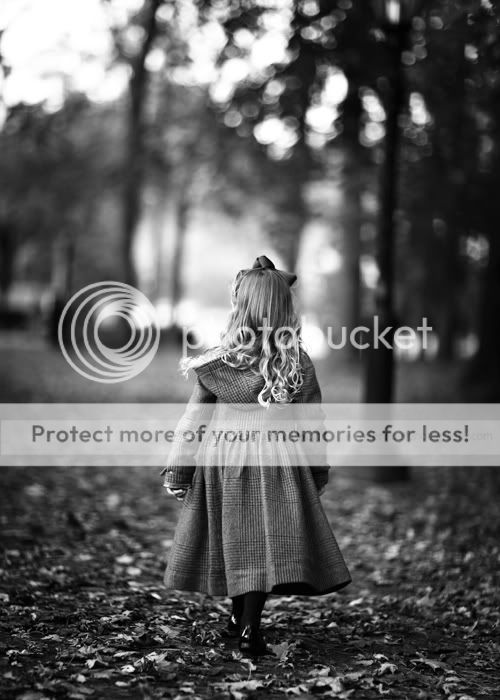
These are nice- good composition in the first two and nice pp color wise- although I think they look a bit hot- too bright.
1. Would love to see a wider aperture being used. The large aperture is making these look a bit more unprofessional.
2. Great Concept. This would have more impact if a wide aperture was used and they were closer to you. Here's one I did recently similar that I think has more impact due to those variables.
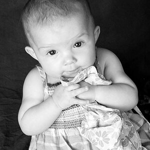
#1 The overall composition might be improved by moving in a bit closer to the subjects to make them a more important part of the photo.
I find their faces are both over exposed and blurry, with a serious lack of detail. Not good
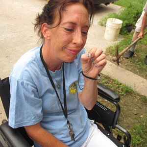
#2 Nice shot and good composition. There is too much space in back of the subject / you centered him too much in the frame
#3 Probably the strongest of the 3 images, however I feel you are too far away from them. Keeping the same composition, zooming in / closing the distance again would of made them a more important part of the photo, they are too small as is.
yes---looking for c&c!
The large background area was a request of the mom...since it was fall...she wanted the foilage in the pictures.
thanks for the input!
Rhonda- I think you could definitely still used that with a bit more artistic eye. Experiment next time and see if you can include foliage but a little more focus on subjects as well.


![[No title]](/data/xfmg/thumbnail/40/40307-b3813381d3c1ef8282c72905405b50fe.jpg?1619739413)