thereyougo!
Been spending a lot of time on here!
- Joined
- Jun 1, 2010
- Messages
- 2,316
- Reaction score
- 1,991
- Location
- UK
- Can others edit my Photos
- Photos OK to edit
Some from the Danish island of Fanø
Sony A7RII Loxia 35 f/2
1.
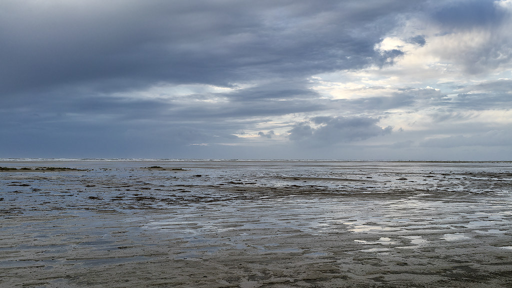 Fanø Sands-2 copy by singingsnapper, on Flickr
2. BW
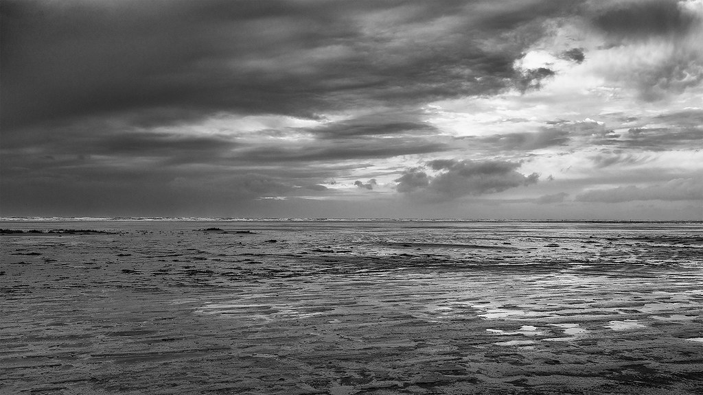 BW Fanø Sands-2 copy by singingsnapper, on Flickr
3.
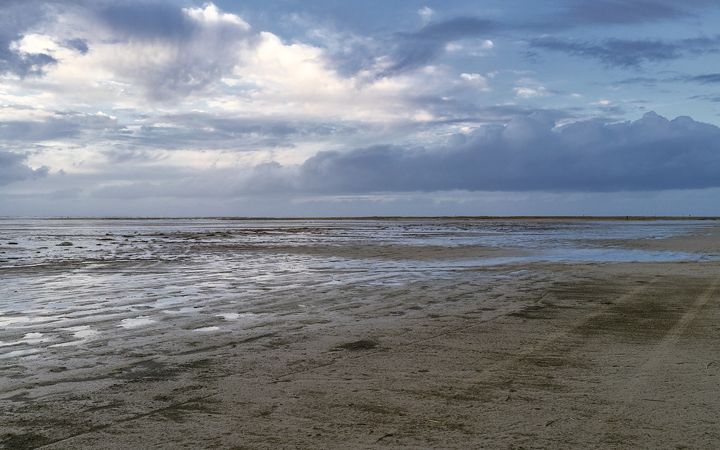 Fanø Sands copy by singingsnapper, on Flickr
4. BW
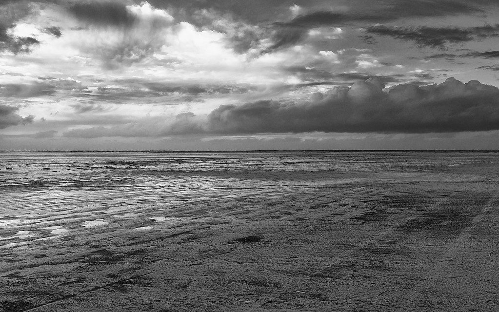 BW Fanø Sands copy by singingsnapper, on Flickr
5.
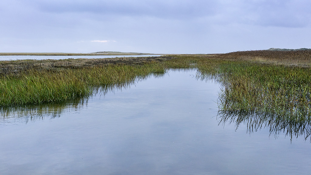 Fanø Old Harbour copy by singingsnapper, on Flickr
6.
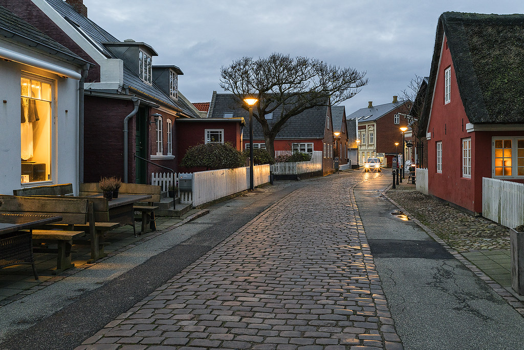 Fanø Town copy by singingsnapper, on Flickr
Sony A7RII Loxia 35 f/2
1.
Fanø Sands-2 copy by singingsnapper, on Flickr2. BW
BW Fanø Sands-2 copy by singingsnapper, on Flickr3.
Fanø Sands copy by singingsnapper, on Flickr4. BW
BW Fanø Sands copy by singingsnapper, on Flickr5.
Fanø Old Harbour copy by singingsnapper, on Flickr6.
Fanø Town copy by singingsnapper, on Flickr") . Go into the lands in the north of Jutland and you will see pure desolation. Not every part has a Nyhavn. Parts of Denmark really are quite bleak. Perhaps I haven't quite captured that. I'm not a slave to rule of thirds especially when cropping to 16:9 as I have with most of these.
. Go into the lands in the north of Jutland and you will see pure desolation. Not every part has a Nyhavn. Parts of Denmark really are quite bleak. Perhaps I haven't quite captured that. I'm not a slave to rule of thirds especially when cropping to 16:9 as I have with most of these.