Fashion shoot with trilif3

camz

No longer a newbie, moving up!
Joined
Jun 11, 2009
Messages
1,878
Reaction score
285
Location
Bay Area
Can others edit my Photos
Photos NOT OK to edit
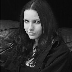
TPF how the heck are you? lol it's been tooooo long. Did a shoot for a triathalon inspired clothing/apparel thought I'd share. The subject below actually races and isn't a model - we thought she did great not being used to being infront of the lens.

Hope all is well folks!

1.
San-Francisco-Fashion-1.jpg


2.
San-Francisco-Fashion-2.jpg


3.
San-Francisco-Fashion-3.jpg


4.
San-Francisco-Fashion-Photographer-4.jpg


5.
San-Francisco-Fashion-Photographer-5.jpg


6.
San-Francisco-Fashion-Photographer-6.jpg
 
Last edited:
Very Nice!
#2 #3 & #6 are my favorite.
Again they are all very very nice.

Gracias! =)

Loving the new branding Cameron..

Thanks man! I had to rebrand, we did 12 weddings this year shooting video alone lol I have no idea where the market for video came from - kinda just fell on our lap. But the rebrand hopefully should be complete for peaking inquiries in our industry by January.
 
nice. Framing is bit tight at the bottom in #6
 
nice. Framing is bit tight at the bottom in #6

Thanks for the feedback - good eye but the photos have already been delivered. Where were you 2 weeks ago when I need the crit man? :greenpbl:
 
I'm trying to figure out how these clothes would suggest triathlon or someone who competes? they look like trashy hipster clothes; especially coupled with you style of post and the urban backgrounds.

Of these I like #2.

I don't like where you placed the model in #1, not quite sure why she's standing in front of a fire station. This could have been cute if she was wearing firefighters boots or a helmet or something, just to have fun with. He cut-off shorts coupled with the boots just make her look short and squat.

#4 is a bit unflattering for me, plus it's a bit overexposed. For someone that's competing she looks a bit out of shape and it looks like her belly is poking out. That pose makes her look wider than I'm sure she is.

#5 would probably do well on their site/ads.

#6 again, bad spot to place the model. Why isn't she in front of the clean background? It's a cute pose, but the styling... And you almost cut off her feet.

I'm also not a huge fan of the post styling here, but at least it was consistent throughout, but that just gives it a more hipster/trendy/cliche vibe to it, not a sporty/triathalon apparel look.
 
I agree that none of these say triathlon to me. Also, after looking at the photos, I had no idea what the name of the company is. Their logo is obscured in all of the photos.
 
I'm trying to figure out how these clothes would suggest triathlon or someone who competes? they look like trashy hipster clothes; especially coupled with you style of post and the urban backgrounds.

Of these I like #2.

I don't like where you placed the model in #1, not quite sure why she's standing in front of a fire station. This could have been cute if she was wearing firefighters boots or a helmet or something, just to have fun with. He cut-off shorts coupled with the boots just make her look short and squat.

#4 is a bit unflattering for me, plus it's a bit overexposed. For someone that's competing she looks a bit out of shape and it looks like her belly is poking out. That pose makes her look wider than I'm sure she is. It' describes the edit, angles and positioning.

#5 would probably do well on their site/ads.

#6 again, bad spot to place the model. Why isn't she in front of the clean background? It's a cute pose, but the styling... And you almost cut off her feet.

I'm also not a huge fan of the post styling here, but at least it was consistent throughout, but that just gives it a more hipster/trendy/cliche vibe to it, not a sporty/triathalon apparel look.


Wow what a crit! Hey man takes for taking the time to write that all out. But it's a triathalon inspired company and without looking at a company's mission statement or credo values you probably won't understand the business target market they are after. No harm no foul as I didn't ellaborate as it wasn't the point.

To place it in perspective, look at companies like Roxy, RipCurl, Reef, Quicksilver etc, all have clothing casual lines but started only in the surfing word. This is not a performance gear used by triathaletes during their races, but a casual attire inspired by triathaletes to wear outside the racing world targeted to the urban young #selfie croud - that's the company's target.

However thanks for the comments!
 
Last edited:
I agree that none of these say triathlon to me. Also, after looking at the photos, I had no idea what the name of the company is. Their logo is obscured in all of the photos.

Good point didn't get to show it with these examples but I delivered over 150 photos and we sure had alot of logos showing with the 6 clothing changes we had. Gracias =)
 
Watch your color palettes. The green/blue/teal thing is fine, with a hint of red in the designs and her hair even is fine. The heavy green background with the red plaid starts to look like christmas, though.
 
Have you actually looked at the websites of the companys you listed? If the photos don't actually have snowboarding/ surfing, etc gear in them, then they're at least in settings where those things take place. I realize that these exotic mountain locations are probably outside of your budget, but surely there's a lake, trail, or bike path that would have been a better setting.
 
Have you actually looked at the websites of the companys you listed? If the photos don't actually have snowboarding/ surfing, etc gear in them, then they're at least in settings where those things take place. I realize that these exotic mountain locations are probably outside of your budget, but surely there's a lake, trail, or bike path that would have been a better setting.

Yes I did =). Go look at the clothing line of roxy and you'll know what I"m talking about. This is not the end all be all shoot for the company and defintely not the last shoot. This particular shoot doesn't speak for the whole scope of the visual motif the company is going for. It's tiny spec in a big pool of ideas my friend.

And what do you mean outside of my budget? this was paid by the company. hmmmm...do you have any industry experience? Where are the pros that use to comment in this site who have added value and understand what's going on?
 
Watch your color palettes. The green/blue/teal thing is fine, with a hint of red in the designs and her hair even is fine. The heavy green background with the red plaid starts to look like christmas, though.

Thanks for pointing that out, I guess it's preference but I see what you mean brah.
 

Most reactions

Back
Top