These are just snapshots with very little regard for composition. Read some photography books, learn photography elements and design basics, as well as technical elements like depth of field, lighting etc.
PS - these comments are about the pictures on your link,not the ones you have posted here, these are a bit better. But can be easily improved upon.
Three shots here are fine (well, three and a half - one has a good idea but missed it compositionally) , but it need some editing. This is a very rough editing since the files are tiny and could not be edited properly:
This picture is alright, I have trimmed it a bit, removed the distracting dark half-silhouette on the right. It is distracting to have the back of man in a bright shirt on the background. But at least you can say you have shot a girl who noone cares about in the room at the moment. I would like to get rid of theat green strip on the left, but that would mean cutting the girls hand and puuting her too close to the edge of the frame. But it can be photoshopped.
I like the idea here, but the big black basket and the whole dark forefront area have too much visual weight and too messy for a balanced composition. I have straighten the photo to the door frame and removed the cut limb ( pay attention to these details!) I also adjusted highlights/shadows. I am unable to further improve it, so it is a miss.
Here I just trimmed the photo to get rid of unnesessary background and to enlarge the face so that shadows would be less busy and have some shape. When trimmed, I like this picture most here.
Here I removed as much of the blown area as possible without ruining the composition and adjusted the colors and contrast
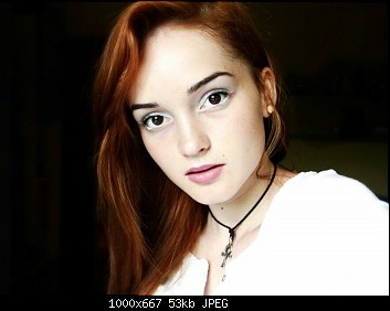
The next portrait is a fascinating subject, and some others will comment on the processing, but for me, you should have framed this shot in vertical format. You see, there is too much empty space on the left side, and you have cropped her head, and not shown enough of her bodice.
The format doesn't bother me, neither does the slight crop of the head. Changing the aspect ratio to 4 x 5 will help minimise the blank space and draw attention to what is actually quite a striking portrait:
These aren't bad, I think you can plan the shot and composition a little better. When I first saw it gave me a phone snap shot feel. But they are not bad like I said.


.jpeg")


![[No title]](/data/xfmg/thumbnail/36/36401-dfb1077e5917eb47c5acf9c208e7be2a.jpg?1619737552)


![[No title]](/data/xfmg/thumbnail/40/40297-5b7d12c4c72c43b505a6f575d338d573.jpg?1619739411)
![[No title]](/data/xfmg/thumbnail/37/37131-0af98967b391a8bd22ce1d14f6afb9cc.jpg?1619737884)
![[No title]](/data/xfmg/thumbnail/37/37138-63809b91a8061d61d48c541f18a69861.jpg?1619737885)