rob171171
TPF Noob!
Hi all
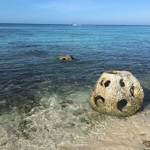
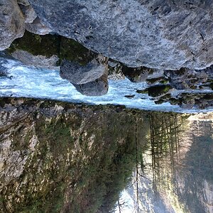
New to this site as I just came across it. Would truly appreciate feedback on my portfolio at http://robphoto.ie
Regards
Rob
New to this site as I just came across it. Would truly appreciate feedback on my portfolio at http://robphoto.ie
Regards
Rob


![[No title]](/data/xfmg/thumbnail/33/33494-b043d63ade80615498faca324203747a.jpg?1619736004)