
bazooka
No longer a newbie, moving up!
- Joined
- Dec 28, 2009
- Messages
- 2,293
- Reaction score
- 294
- Location
- Houston
- Website
- www.dirtjournal.com
- Can others edit my Photos
- Photos OK to edit
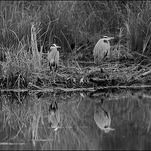
Yet another solid photograph. You've come a long way.
I like the comp, I like the light. The only recommendations I would make are PP adjustments and are completely subjective.
The image has a yellow tone to it. Also, I feel the bird needs to be separated from the background a bit more, both in color and tone.
Finally, the right and bottom edges have some brighter areas that I would like better if they were more subdued.
Here is a 15 minute edit consisting of curve adjustments and hue/saturation adjustments, a touch of burning on the edge bright brances and dodging on the front edge of the bird. I also added some sharpening at the end. I have the psd if you would like it. Again, this is just my personal preference and I'm just providing it as an alternative to consider and compare. Feel free to not like it.
")
![[No title]](/data/xfmg/thumbnail/30/30861-fee88082ba36d0c3b443492fe3f3f1cd.jpg?1619734481)

![[No title]](/data/xfmg/thumbnail/30/30862-d177ccfc3a82369b1005863cfe5fd13d.jpg?1619734481)
![[No title]](/data/xfmg/thumbnail/37/37111-64f64f2c8371420041bf39244ff12117.jpg?1619737882)
![[No title]](/data/xfmg/thumbnail/37/37109-62e1b65e6f8bd2a349250acd6d653f1e.jpg?1619737882)
![[No title]](/data/xfmg/thumbnail/32/32156-d6cfe2865ceed861a0633752a006ea20.jpg?1619735234)