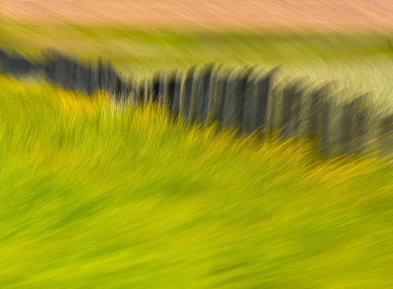
Designer's edit feels really awkward to me. The flip of the fence just doesn't work in my opinion and as others mentioned -too much of the open feel is gone.
Thanks so much for your thoughts everyone! I will carry them forward with me
I actually had a wider composition to start and kept wavering on it, I'm not sure how I feel about the triangle of lighter grass on the right so it led me to the more square crop. I quite like it square and perhaps on board with making it perfectly square a opposed to allllllmost. I will try that when I'm editing the rest today For now here is the wider crop that I originally started with.
I hope you don't mind my fooling with it. I thought it needed a flip and a tilt. Line in a composition tends to be more positive if it rises to the right, and by placing more of the dark mass lower in the frame, it tends to stabilize the composition. The crop was only to square it off after tilting.
I don't mind at all, thanks for taking the time to do the edit! Funny thing is you flipped it back to "right" again, I flipped it because I think the lines read better, it flows from left to right with the flip whereas the original (your flip) doesn't have the same flow to me.
I hope you don't mind my fooling with it. I thought it needed a flip and a tilt. Line in a composition tends to be more positive if it rises to the right, and by placing more of the dark mass lower in the frame, it tends to stabilize the composition. The crop was only to square it off after tilting.
I think you did a good job editing this image, which is quite malleable.You used solid principles of composition and design. I do like the original better. On your edit the rush of straight lines comes in from the bottom right. In the original from the bottom left. For most viewers, (buyers) compositional elements leading from left to right have a psychologically more pleasing felling. It's a keeper, little bunny.

")


![[No title]](/data/xfmg/thumbnail/31/31039-558cdb3d311dc67b7a2134527e230488.jpg?1619734582)