JeffieLove
No longer a newbie, moving up!
- Joined
- Feb 8, 2010
- Messages
- 1,601
- Reaction score
- 15
- Location
- Elkton, MD
- Can others edit my Photos
- Photos OK to edit
These are some shots I got today at the park and zoo with my kids ") WDYT?
WDYT?
The Silenced Woman: I can see in this shot that I seem to have lost some detail in the stone. Any suggestions on how to not lose detail? I did play with the contrast, midtone contrast, brightness, and shadows in PP but none of them really did anything except for darken shadows... I think the detail was lost in the original unedited. I will post it if anyone wants to see it.
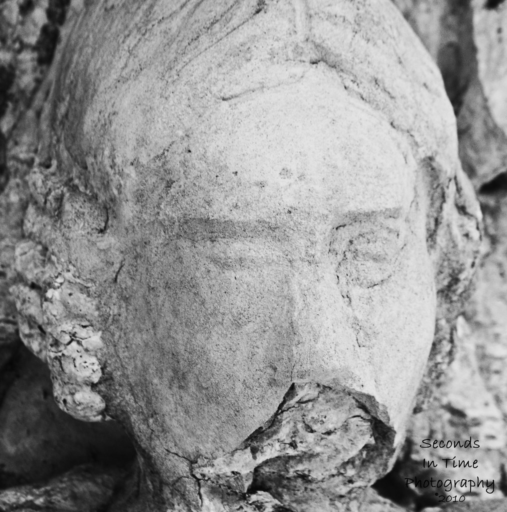
1/160, f/10, 300mm, ISO800
The Dying Tiger
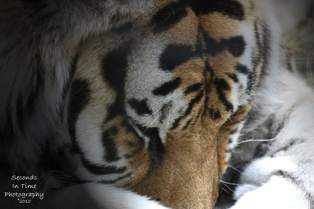
1/60, f/5.6, 300mm, ISO800
*This tiger isn't really dying in this picture, but she is 19 years old. I was told by a zoo keeper that tigers only live 18-20 years in captivity. That is why I named this picture the dying tiger. I did add a lighting effect filter in PSE8 and that is how I got the lighting look I have
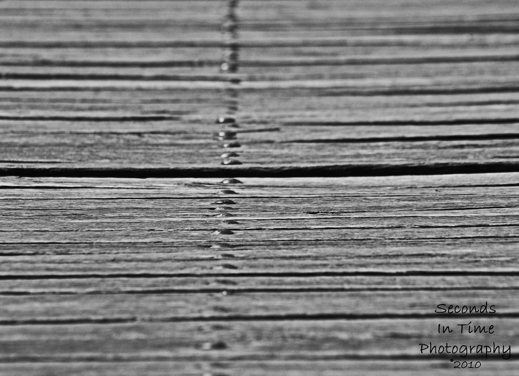
No name:

1/1000, f/11, 300mm, ISO800
I believe I had the macro setting on the lens on for this shot.
The Bridge
1/640, f/10, 263mm, ISO800
This was my attempt at abstract.. or something along those lines (no pun intended)...
WDYT? The Silenced Woman: I can see in this shot that I seem to have lost some detail in the stone. Any suggestions on how to not lose detail? I did play with the contrast, midtone contrast, brightness, and shadows in PP but none of them really did anything except for darken shadows... I think the detail was lost in the original unedited. I will post it if anyone wants to see it.
1/160, f/10, 300mm, ISO800
The Dying Tiger
1/60, f/5.6, 300mm, ISO800
*This tiger isn't really dying in this picture, but she is 19 years old. I was told by a zoo keeper that tigers only live 18-20 years in captivity. That is why I named this picture the dying tiger. I did add a lighting effect filter in PSE8 and that is how I got the lighting look I have
No name:
1/1000, f/11, 300mm, ISO800
I believe I had the macro setting on the lens on for this shot.
The Bridge
1/640, f/10, 263mm, ISO800
This was my attempt at abstract.. or something along those lines (no pun intended)...
Last edited:


![[No title]](/data/xfmg/thumbnail/31/31012-f5e0c7cdea2f2c3e44737e3f61c2461a.jpg?1619734567)