Few from my shoots

Holly

TPF Noob!
Joined
Oct 2, 2005
Messages
1,143
Reaction score
7
Can others edit my Photos
Photos OK to edit
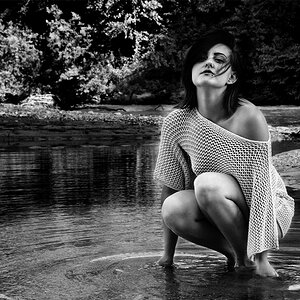
I had two shoots this weekend... They were a ton of fun and the children were awesome to say the least!! :) wanted to share a few of them...

Saturdays Shoot-

1.jpg


4.jpg


3.jpg


Sunday SHoot - Her husband is being deployed on the 9th and she wanted photos done before he left... ONce she gets them she will mail him some so he has photos of every one...


4.jpg


5.jpg


9.jpg


36.jpg


49.jpg


Thanks for looking
 
First, I don't know if it's just me, but I find these copywright stamps very distracting. Second, I'm not a pro, so take what I say with a grain of salt. In that first shot, what is that thing hanging down that looks like a pull for blinds in mid air to the left? I'd clone that out. Also not a big fan of the tight crop on this one. It's a large family and they look too crowded and the lighting looks a little flat. The second two are too underexposed in my opinion and need some fill flash. I think overall, the second shoot was better. Those too look a hair underexposed as well IMO and could use a bump in contrast.

I really like the next to last one, that's a nice pic. I like the first 2 of that set as well.
 
Thanks !! :)

YEs the first shoot was not an easy one.. The place was very small.. She seen the photos and said DONT change a thing.. She prefers the *natural* at home photos compared to the in store or edited photos just to make them look better.. I did tell I was NOT happy with the results once I was able to view them from home.. SHE however asked to see them and in the end she is pleased... I Offered to reshoot and she likes what she sees... She plans to have me back there.. hopefully I its cloudy out or we pick a big field like the second shoot

STill learning! We all start some where :) Thanks for your thoughts and tips for my photos...
 
Saturday Shoot: Some very nice shots here. I like the angle and composition of the second shot best, but it feels a touch too dark (I'm viewing the pics on my uncalibrated work monitor, so take any color issues with a grain of salt as they may not be perfectly accurate). I like the contrast present in the first picture more. As the previous posted pointed out, however, I'd clone out the fan pull.

Sunday Shoot: Not sure what the lighting was like that day, but a lot of the colors feel washed out to me. This is most evident in the last picture where the skin tones all look rather gray to me. Once again, though, this may simply be the error of the monitor I'm on. I like the angles of #2 and #4 the best.
 
Good job, Holly! Yeah... something is goin' wrong with the color/levels. Most all of these look a bit muddy on my monitor.

Sadly, I'm not the guy to help you with this. I'm sure someone here will know what to do.

Nice start!

Pete
 
Thanks every one..

Sundays session was Sunny but we stood in the shade...
http://www.vapack922.org/photography1/tomeka
I NOTICED that they look ODD in forums and on my website compared to my paint shop pro.... IF you copy and paste it in there does it look ligther darker ?
 
I need help understanding washed out... TO ME if they are to LIGHT they are washed out.. SO I Thought thats how others viewed it to.. I am thinking I read them the wrong way ... Yikes...

So with that said.. Whats washed out? out of these three.. which would you go with?

3.jpg


2.jpg


1.jpg


TO me in the First and last one his skin is SO light... it looks washed out to me... Where as the second one it has more color and tint to it?


Im so lost now LOL
 
I think 2 is good too, BUT... lacks "snap." Maybe a boost in contrast? A give-away (at least for me) is the baby's breath isn't white. In my mind, it should look whiter.

Pete


Also... is the background color of his shirt white or pale blue?
 
the last one for me is best... :D

and about the shoots: the first series look very dark for me... the people are black and in the second picture you can hardly distinguish the man from the tree in background. I would move them to a "lighter background area" :)

and the second series: I had doubts about the last one... my first thought was: "why it is so tilted"... but then i noticed that it looks nice. you should remember that such "tilted" compositions have pros and cons - there are people lovin' it and hating it... I like it :D
 
Thanks!

I Agree I wish I had a lighter background to go with... Like I said I let her know Id do a reshoot so we are going to put one together.. It was tricky but I did try! LOL...

Thanks Mentos! :)
 
Hey Holly! First I want to say that I think you have a terrific eye for composition. But, I think that your coloring in these are way off. The second set seems very gray and lackluster, and the first set seem very dark. I know that you said that the woman was happy with the first set, but I thought I would show you an example of what could be done to improve these in literally less than a minute in post processing. Also, the second set seems to have a heavy green/blue cast to them. Hope you don't mind me posting these, but there's really no way to explain what I mean...it's just more helpful (I think) to show you.

Original:


Edit:


Original:


Edit:


Original:
[URL=http://imageshack.us][/URL]

Edit:
[URL=http://imageshack.us][/URL]
 
Can't agree more with the critiques and wonderful edits bowronfam3!

Just a quick question Holly, do you use custom white balance? That might help to keep the post processing part down and help them from looking 'muddy'. (Though I have a similar problem when I post to the web, it almost seems as if the colour is sucked out)
 
Wow thanks for all the help

Brittany, I used the preset white balance on the Nikon using the WHITE set they have set in there already.. Clicked yes and went from there.. NOT sure why the green/blue overcasting is on the photos! I keep trying to figure it out myself... Im doing all of these in Manual and using the Meter to tell me if its ok or not before I snap.. OK A few of the really dark images I had I forgot (Blushing) But the rest were spot on Zero...

Bowron Thanks for the edit Previews THey look great... MY wonder then is.. does it look to Pixeled IF its that bright??? Thats what IM afraid of when I edit them myself.. I had a few like that but put them back because I felt it would look pixeled when they were printed...
 
I did notice a little bit of pixelation in the edit of the first shoot, but you can always soften it up a little by adding a guassian blur to the most pixelated areas...just careful not to add too much that it's obvious. Otherwise, as long as you just keep a close eye on all portions of the photo, it shouldn't print pixelated.
 

Most reactions

Back
Top