- Joined
- Nov 19, 2010
- Messages
- 2,507
- Reaction score
- 440
- Location
- San Jose, CA
- Can others edit my Photos
- Photos OK to edit
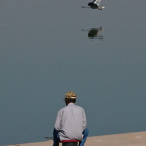
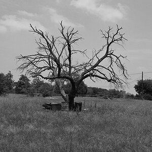
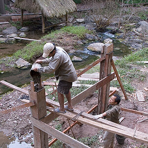
I've recently found the motivation to establish myself as a photographer, and move closer to my goals. To bolster this process, I've taken the time to get a proper portfolio made. It's still under construction, but I have included many of my favorite photographs. How can I make it better? Any feedback/advice is appreciated.
www.trevorwillphoto.com
Also, any feedback on the logo? I don't plan on watermarking my work, it's more of a graphic to be used on my website / business card.
www.trevorwillphoto.com
Also, any feedback on the logo? I don't plan on watermarking my work, it's more of a graphic to be used on my website / business card.
 Gorgeous!
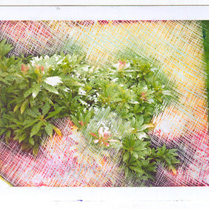
![[No title]](/data/xfmg/thumbnail/32/32710-b10dfc8ee698235cdc1e7572139173e8.jpg?1619735614)
![[No title]](/data/xfmg/thumbnail/32/32709-80f0f0432fd5ec548a3efdb60ef77d46.jpg?1619735613)