
Geaux
No longer a newbie, moving up!
- Joined
- Feb 21, 2010
- Messages
- 2,522
- Reaction score
- 464
- Location
- New Orleans, LA
- Can others edit my Photos
- Photos OK to edit
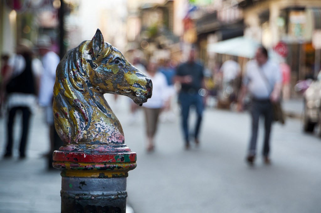
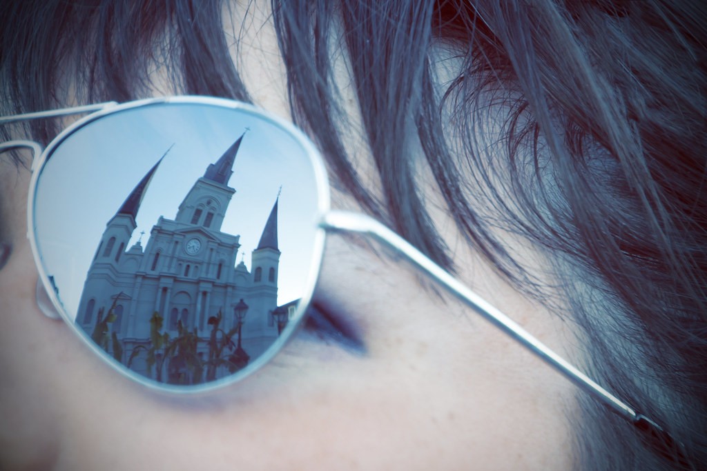
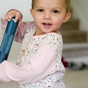
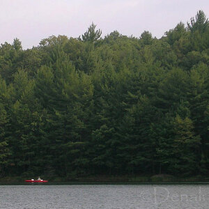
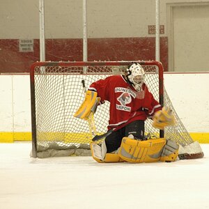
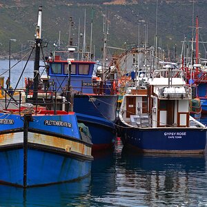
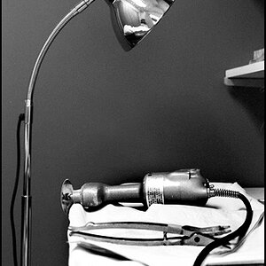
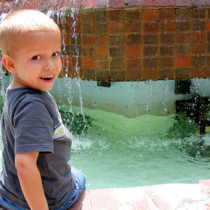
With Mardi Gras and St. Patricks day festivities all coming to a close, I finally got a chance to go out and shoot some. Not many keepers for the day, but here are 4 that I enjoyed. The editing style might not be up some peoples alley, but I've been trying to find an editing "style" and for right now, I'm really liking a "cool" (temperature) vintage style of editing. Most vintage you see is very warm, but I wanted to go a different route. I have the originals edited too if you'd like to see them.
1.
2.

3.
4.

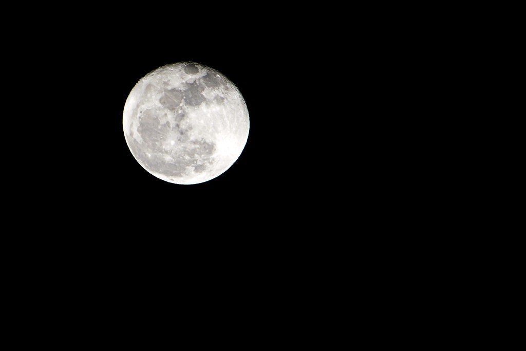
*BONUS* First time Moon shot")
Thanks for looking
1.
2.
3.
4.
*BONUS* First time Moon shot
Thanks for looking


![[No title]](/data/xfmg/thumbnail/42/42458-8274869c9294d2f0655f80c8f0e6048c.jpg?1619740191)