sam0182
TPF Noob!
- Joined
- Sep 16, 2009
- Messages
- 31
- Reaction score
- 0
- Location
- WA USA
- Can others edit my Photos
- Photos NOT OK to edit
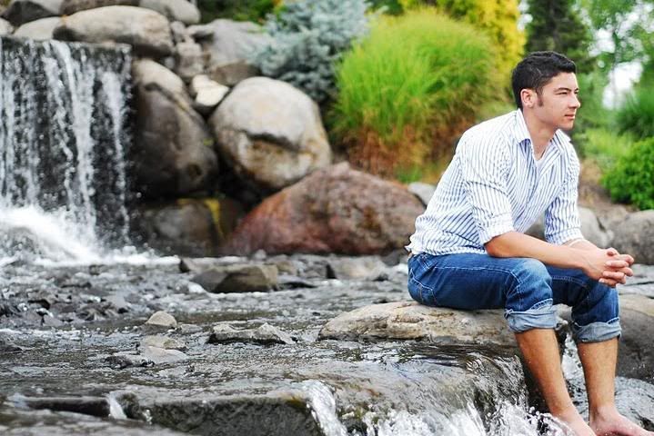
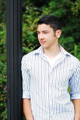
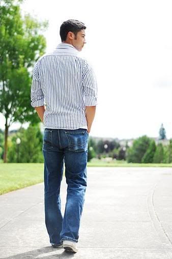
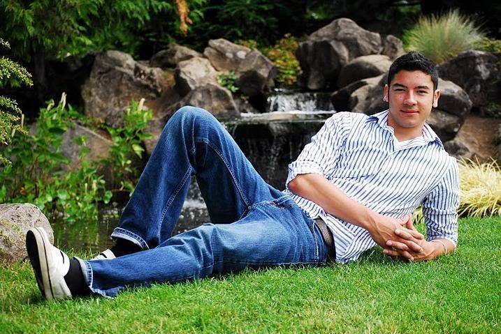
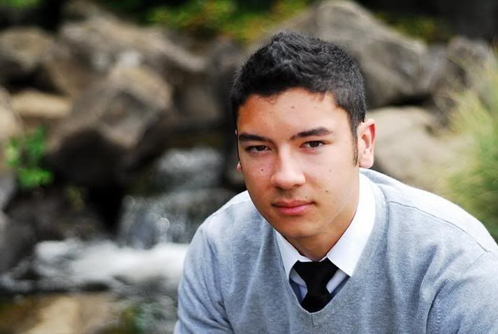
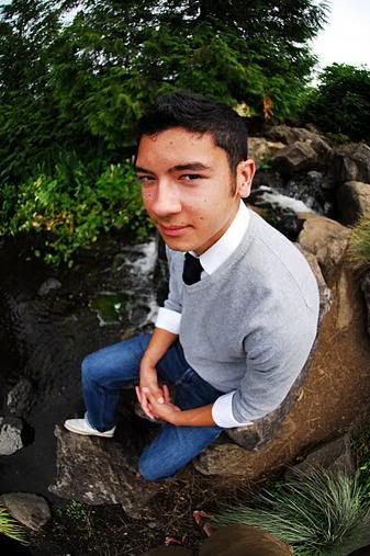
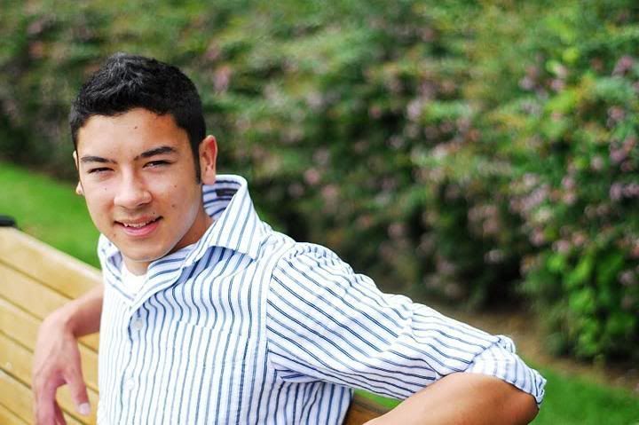
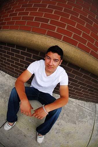
Looking for some feedback please. Shot my first senior over the weekend. These pictures have not been touched at all (no post process). Unfortunately, clarity took a hit with the Photobucket upload. I'll have them up on Flickr later.
Thanks everyone...
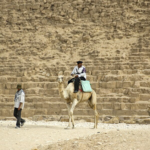
1:
2:
3:
4:

5:
6:
7:
8:
9:
10:
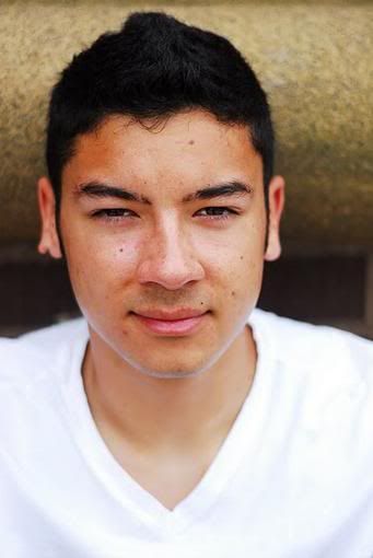
*FYI, these were a trial run, the senior is already scheduled with a "true" local photographer and was doing me a big favor in terms of practice and possible portfolio additions. However, the senior and parents were extremely pleased with the raw results and may end up using a couple of the shots.*
Have at it! Thanks again")
Thanks everyone...
1:
2:
3:
4:
5:
6:
7:
8:
9:
10:
*FYI, these were a trial run, the senior is already scheduled with a "true" local photographer and was doing me a big favor in terms of practice and possible portfolio additions. However, the senior and parents were extremely pleased with the raw results and may end up using a couple of the shots.*
Have at it! Thanks again
Last edited:


![[No title]](/data/xfmg/thumbnail/35/35212-039632ef3763350189fc49390cb7eadf.jpg?1619736950)

![[No title]](/data/xfmg/thumbnail/36/36302-6ee4929dfdf80290ffd73704693e860f.jpg?1619737496)
![[No title]](/data/xfmg/thumbnail/36/36300-760519cb9a8ebbfc57cc3d1fda5dd37c.jpg?1619737494)