RNCC
TPF Noob!
- Joined
- Aug 18, 2011
- Messages
- 14
- Reaction score
- 3
- Location
- AL
- Can others edit my Photos
- Photos OK to edit
Honesty, please.
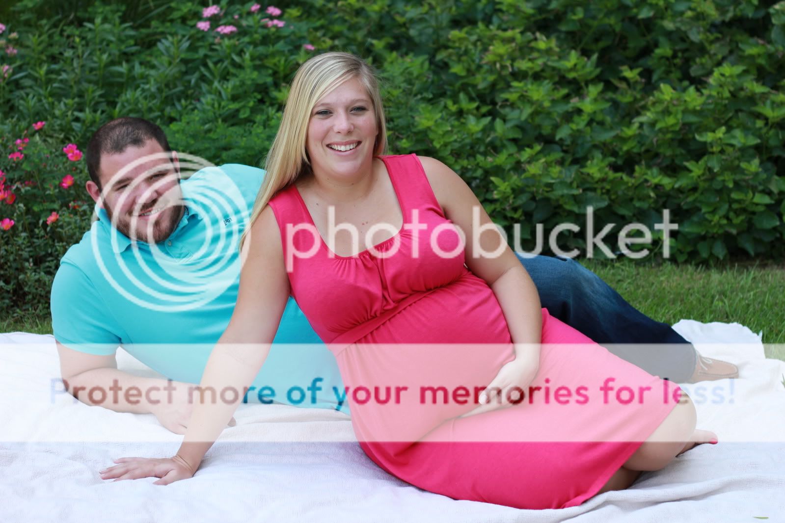
My first maternity shoot period. We had to do it on the hospital grounds because Mom is spending the rest of her pregnancy there for observation due to complications.
#1

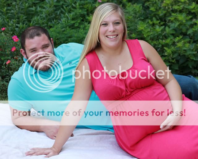
#2

#3

#4

#5

My first maternity shoot period. We had to do it on the hospital grounds because Mom is spending the rest of her pregnancy there for observation due to complications.
#1
#2
#3
#4
#5
Last edited:
")