MikeLem
TPF Noob!
- Joined
- Nov 26, 2009
- Messages
- 107
- Reaction score
- 6
- Location
- Central MA
- Website
- mikelemovitz.com
- Can others edit my Photos
- Photos NOT OK to edit
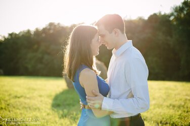
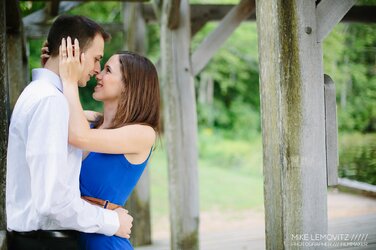
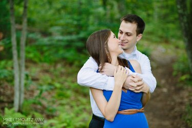
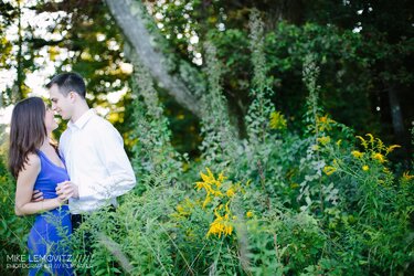
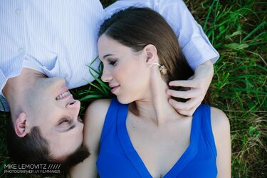
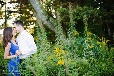
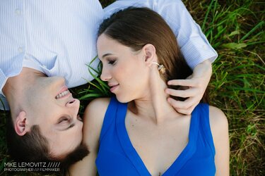
So, with my focus shifting towards photo/video for business, engagement sessions have become a rarity. I was contacted by this couple through my website (probably via Google), and shot their e-session today.
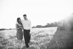
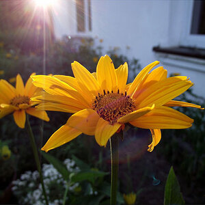
A few self-critiques: The lens flare from the 50mm f/1.4 is not as clean as I remembered it being. Going to have to re-evaluate my lens choice for future sessions. If I had it to do over, I would've shot some of this stuff about a stop under. The couple loves them, which is most important, but it would have saved me some trouble in Lightroom.
#1
#2
#3
#4
#5
#6
A few self-critiques: The lens flare from the 50mm f/1.4 is not as clean as I remembered it being. Going to have to re-evaluate my lens choice for future sessions. If I had it to do over, I would've shot some of this stuff about a stop under. The couple loves them, which is most important, but it would have saved me some trouble in Lightroom.
#1

#2

#3

#4

#5

#6




![[No title]](/data/xfmg/thumbnail/42/42279-f60778d39180ee6cd87fc84a15559b96.jpg?1619740087)


![[No title]](/data/xfmg/thumbnail/42/42280-60cc6d4893a2f440eac7dd2248e733a9.jpg?1619740088)
![[No title]](/data/xfmg/thumbnail/38/38266-292dc43125dad0d89dbd806503618171.jpg?1619738549)

