First Post of my images

SMG

TPF Noob!
Joined
Sep 18, 2006
Messages
23
Reaction score
0
Can others edit my Photos
Photos NOT OK to edit
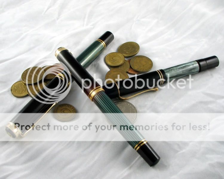
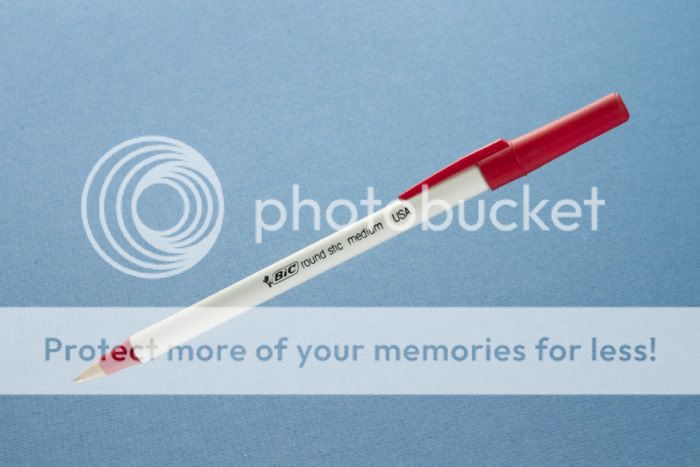
Just thought that I would post a couple of shots that I have done here and there for my own pleasure. These were ostensibly to sell Fountain pens which I collect and repair (and sell duh!), but they kindof fit into this forum.

Let me know what you think.

Cheers,
SG
DSC_6254.jpg


emerald.jpg


Flockopelikans.jpg


nib2800pix.jpg
 
I'll give you some technical comments just from the perspective of commercial product photography.

#1 is a nice macro shot. I see some blue ink smeared on the nib. Also, the background has variable sharpness. It is sharp lower left to soft upper right. It would have been better to adjust depth of field just to cover the nib but throw the background slightly out of focus. The gold of the background interferes with the gold of the nib. The gold on the background should be further away from the nib. Raise the pen higher so that it is further away from the background.

#2 A pretty good shot. I see some lint that you should have cleaned up in post process. The set has more contrast than I like between subject and accessories. The lightest area of the bank note is nearly blown out while the pen (your main subject) is pretty dark, particularly in the area where the pen is on the background itself. Perhaps, if you had made the entire background out of bank notes, it would have put more snap in the final image. Contrast between background and subject is good in product photography. Contrast between subject and accessories in the set is less good when everything is in focus.

#3 This one is the best of the lot. Perhaps, because I like Pelikan pens personally. :) You did get a harsh reflection on the upper pen. It is likely a lighting problem.

#4. Here you need to control depth of field better. The nib is sharp from the tip to the Scheaffer text and then softens toward the barrel of the pen. The depth of field needs to cover all of the text. Other parts of the pen can be soft but all the text should all be crisp and sharp. Try different apertures or perhaps a less extreme angle.

I think these are comments you might get from an art director at an ad agency. They are meant to be constructive. Overall, you have a good sense for decorating a photographic set to make it interesting. I'll try to reproduce some of your shots with some of my own pens as a personal assignment. Then you can critique mine. It will be fun.
 
Thanks for the input. I really appreciate it.

I did actually see the ink in #1, but it's pretty hard to clean one of these nibs totally when it is full, guess I could have cleaned it further or cloned it out in post processing. I have a couple more from that setup that are a little more concentrated on the nib with a better depth of field, nib in focus background blurred. The Makie-e box that I posed the pen on is pretty much like a mirror so I need to might just post process that down a bit.

For #2 I think that I have another version of this where I cloned out the lint. Thanks, I didn't review this one much before posting it, that will teach me to look a little harder at the shot before sending it out. :)

For #3 I acutally put a couple of lens flares in in Photoshop to bring interest to the gold trim, but probably went a little overboard, as I am still learning PS.

#4 is my favorite, but I know what you mean. I really wanted all of the text in focus, but actually liked the softness of the image.
All of the shots in my first post were taken with my D50 and either a 70-300 Sigma Macro II or my new 105mm f2.8 macro Sigma.


Here is another that I like as well. Shot this with my old setup, Canon S2IS and light tent.
IMG_2658.jpg


The yellow from the background picks up the mottled bands in the pen, but the red corner at the top right is problematic.
Thanks again for the critique, I am always open to constructive comments.

Cheers,
SG
 
The one above is pretty nice. There isn't quite enough light on the right end of barrel and there is something that doesn't belong in the upper right hand corner but overall it is pretty good.

I did the easy one first. I think it is close enough to your #4 to make the point.

auroranib.jpg


You can see that all of the text on the nib is crisp. Look at the background and you can see that I stopped the depth of field right at the point where it would keep the word Aurora in focus. The problem is that it required an aperture of f36. Your lens may not go that small. If it doesn't then you just need to back up a little from the subject and then crop the image.

If you like a softer background then it is just a matter of lifting the pen away from the background about 3 inches. That would throw the background out of focus.
 
Cool image. Yeah my 105 sigma will go down to f32 so I can replicate that. I will try tonight or tomorrw, babysitting duties tonight so no time to play with the camera :(

Thanks for the advise. I really appreciate it.

Cheers,
SG
 
Here's #2, the Parker pen with black flashlight. I don't have any cool bank notes laying around so I used a map. Perhaps a little busy but I was trying to tone down the contrast between accessories and image. My Parker pen doesn't do battle with any of the accessories. It is clearly the subject of the photograph. The accessory became the background. What do you think?

parkerpen.jpg
 
Here's #3, the Pelikan pens on a white background. I'm not happy with the way the set is accessorized. I didn't spend much time on it and I wouldn't show it to an art director. But I wanted to show you that it is possible to capture the brilliance and shinyness of the gold plated hardware on the pens without having it look soft or blown out. This is what light tents do very well. I'll do better on #1.

pelikanpens.jpg
 
gee... I have no collectible pens. I'll just stand over here....

Nobody said anything about needing collectible pens. See what you can do with a Bic. That sounds like more of a challenge than making fancy fountain pens look interesting.
 
How far away from the light tent sides are your lights? I have mine touching the sides of the tent to get the amount of light that I need or wan, but that tends to give me some blown out highlights or hot spots.

I just bought a sb600 last week, and will be starting to work with flash lighting instead of constant. Currently I have a couple of daylight balanced fluorescent bulbs (the twisty kind) in 10" reflectors just basically clamped to the top of my light tent. I bought a lumiquest diffuser for the flash head and it seems to be OK, but I might need to play with the fill flash settings a bit to get the correct amount of light without blowing it out.

I see what you mean about the balance of the flashlight/pen shot. Nice Duofold by the way. The background doesn't clash with the pen as there are no broken edges or lines traversing the image to take your attention away from the subject. The lines on the map are there, but they are so slight that it doesn't impact the image.

I will have to post the image of the Pelikans without the lens flares, I think that it will be much better.

Thanks for the dialogue, it is cool to learn in this manner instead of trying to figure it out on my own.

Cheers,
SG
 
Here's a snapshot of my light tent setup. I have to get busy invoicing the day's work so I'll finish up when the invoicing is done.

lighttent.jpg
 
Fred, thanks so much for taking the time to help me out. I appreciate your comments more than you know.

Cool Bic stick shot, seems like it is floating. Did you have to remove any supports in PS afterwards??

It looks like the arrangement of the lights to the lilght tent will make for a softer light overall. Guess that it makes sense. Time to start reading up on lighting I guess. Any suggestions on where to start??

Cheers,
SG
 

Most reactions

Back
Top