First post, thought I'd see what you guys thought...

Pennywise

TPF Noob!
Joined
Apr 5, 2007
Messages
58
Reaction score
0
Location
Boston, Ma
Website
www.ilovesleepers.com
Can others edit my Photos
Photos OK to edit
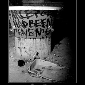
I figure I'd name the picture "Take a seat" This is about a block away from my work and I found it pretty funny...

DSC_3026.jpg


I tried a few different ways of editing, just thought I would get suggestions. Thanks!
 
It's alright but IMO a little overboard on the toning.
 
i agree with maxbloom (i do? wow... haha) desaturate.
 
creepy "dead end, with seat"....waiting to die
 
I agree about the color too.
Other than that I think this picture is a great find!!!
It's kinda creepy yet hilarious at the same time *scratches head*.
 
Great input, thanks guys... here is the orig, one with some color and a pure b&w...

DSC_3025_Medium.jpg


DSC_3025color.jpg


DSC_3026_001.jpg


I didn't even get out of my car to take the picture lol. I thought that the yellow tint would make it look more creepy.
 
b&w with the crop is by far the best. The composition of the original is extremely central and looks like a snapshot, the toning*was overdone, and selective coloring should be used sparingly. I would go with the b&w.
 
Your decision to crop this photo was your first very necessary step towards making a very "normal" photo, flat in colour, contrast, toning and compositional elements, into something that makes people stop and look and think. Well done. For the find of the subject is interesting, only was your original photo not that interesting.

But in cropping it the way you do and in focusing on the only two necessary elements, you went a huge step ahead. Since colours are so dull, a conversion into black and white and addition of contrasts helps.

The yellow toning as opposed to pure black and white is a matter of personal tastes, I think. It does make the entire photo a tad more eerie looking.

The desaturated version makes most obvious that the bench is not quite in focus, which does not show that very much in both the pure b&w and in the tinted version. Which is why I must say I personally like them both - might even lean towards the yellow tint. That would not have been my personal choice, I'd have added a tad red to it, too, but ... the picture seems to be the sharpest of the lot, and - agreed! - the creepiest.
 
The composition of the original is extremely central and looks like a snapshot

haha... it pratically was a snapshot, I took it while I was driving :)

I agree though, I don't do very many B&W, but this one suits well for it :thumbup: :thumbup:

LaFoto - Great write-up. You are spot on with my thinking when I noticed this op. I thought that the eerie feel would make people think more.
 
I agree on the toning ...
also, I think the sign is cropped too tightly... at least for my taste.

Wow, that is quite an extreme crop you did anyway ;)
 
I have to agree with Alex about the crop. I think that if you where crop it a liiiiittle bit wider on the right so that the sign was on a third I think that it would improve it quite a bit. And here's just a thought... If you had a guy dressed in rags sitting on the bench and looking as if he has no where else to turn you might have a really good picture on your hand.
 
I have to agree with Alex about the crop. I think that if you where crop it a liiiiittle bit wider on the right so that the sign was on a third I think that it would improve it quite a bit.

Me too.

As for what LaFoto wrote about colouring being a matter of personal taste - I prefer the versions with the yellow bits and pieces to the purely B&W ones. Eerie IS the word...
 

Most reactions

Back
Top