First time working with studio equipment

AngieDoogles

TPF Noob!
Joined
Feb 23, 2008
Messages
76
Reaction score
4
Location
TN
Can others edit my Photos
Photos OK to edit
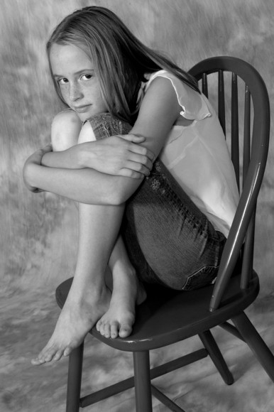
This was my first time working with studio equipment and lighting. I loved it and can't wait to practice again! Any C&C welcome! Thanks! :)

1.
m166556891.jpg


2.
m166556788.jpg


3.
m166556399.jpg


4.
m166555712.jpg


5.
m166555630.jpg


6.
m166554935.jpg
 
Last edited:
Too many to comment on. But all look like nice exposures...the first one the focus is a little off, but the rest look nice. Thanks for sharing.
 
Anyone else? I would LOVE to get really detailed suggestions about what is wrong and how I can improve. Honest, harsh criticism is what I'm looking for.
 
It's hard to offer detailed critique on so many images at once. Keep it to one or two images when you want more detailed comments. It also helps if you offer some explanations as to what you were going for and what you did/tried in order to get that.

#1 is pretty good but it doesn't seem perfectly sharp. It's hard to tell on this small version though. I'd like to see her face be brighter. As it is, her foot is fairly bright and draws attention away from the face.

#2. I think this one could be a bit brighter as well (although I'm not viewing it on a calibrated monitor). Here eyes have two small catch lights, I'd prefer to see just one big one. Still, it's a very nice shot.

The rest are pretty good, a few small issues maybe. I think the cropping is a bit tight on some of them, above her head especially. You don't want to leave a lot of space up there, but when there is space on her sides, it probably shouldn't be cropped so tight on the top. Again, I'd like to see a nice big catch light. How are you setting up your lights? Try placing your main/key light as close as possible and keeping your fill light farther away.
 
1. Focus is soft, I find the background distracting/busy. Cute pose, though.

2. Not crazy about the birds-eye view (personal preference) nor the chopped-off digits.

3. Nice exposure. Amputated scalp and hand. Smile/pose seems forced.

4. Best of the group. Looks natural and relaxed. Any criticisms would be nit-picking. Nice job.

5. Left hand MIA. Are you an orthopedic surgeon by any chance? :wink: Looks like she's getting tired of the shoot.

6. There's that birds-eye view again. Nicely exposed, though, and nice smile.

Jon
 
I'm not a great person to be critiquing these, since I don't have much (read: any) experience with studio equipment, but for some really good info on lighting setups, check out The F-Stop Mag.
 
Thanks for the responses. This kind of feedback is exactly what I wanted when I joined this forum. This thread has been more helpful than any other thread I've posted. I really, really appreciate the responses.

It's hard to offer detailed critique on so many images at once. Keep it to one or two images when you want more detailed comments.

I will keep that in mind in the future. I definitely want detailed critique. Can't improve without it. :)

It also helps if you offer some explanations as to what you were going for and what you did/tried in order to get that.

For this shoot, since it was my first, I was just trying to get decent portraits, proper exposure, learn a little about posing, etc. (I'm trying to learn so basically everything is new.) The model was incredibly shy so that made things a bit challenging on top of trying to figure out how the lights worked and where to place them.


#1 is pretty good but it doesn't seem perfectly sharp. It's hard to tell on this small version though. I'd like to see her face be brighter. As it is, her foot is fairly bright and draws attention away from the face.

I noticed the out of focus look too. It's perfectly sharp in the original...maybe I lost quality when uploading...

#2. I think this one could be a bit brighter as well (although I'm not viewing it on a calibrated monitor). Here eyes have two small catch lights, I'd prefer to see just one big one. Still, it's a very nice shot.

My monitor isn't calibrated either so the problem could be on my end. The two catch lights are because I used two lights, one on each side. I had no idea how to set them up so I just played around a bit. I'm planning on using the link provided by ChrisOquist and hopefully I'll have a better result next time.

Again, I'd like to see a nice big catch light. How are you setting up your lights? Try placing your main/key light as close as possible and keeping your fill light farther away.

I'll try that next time. Thanks so much for the suggestion!
 
1. Focus is soft, I find the background distracting/busy. Cute pose, though.

2. Not crazy about the birds-eye view (personal preference) nor the chopped-off digits.

3. Nice exposure. Amputated scalp and hand. Smile/pose seems forced.

4. Best of the group. Looks natural and relaxed. Any criticisms would be nit-picking. Nice job.

5. Left hand MIA. Are you an orthopedic surgeon by any chance? :wink: Looks like she's getting tired of the shoot.

6. There's that birds-eye view again. Nicely exposed, though, and nice smile.

Jon

1. It looks sharper in the original. I'll try to stay away from that background from now on. It was just easier to work with than the white. ;)

2. I like bird's eye views. Maybe I'm just weird. :)

3. She was incredibly shy, but I'll try to get more natural looks...

4. Thanks so much!

5. Lol, point taken.

6. Again, I thought it was a cute angle.

Thanks for the feedback. I can't tell you how happy I am to have such detailed and specific criticisms. I will definitely try to keep those things in mind next time I'm in the studio.
 
I'm not a great person to be critiquing these, since I don't have much (read: any) experience with studio equipment, but for some really good info on lighting setups, check out The F-Stop Mag.

Thanks for the link! I will certainly check it out.
 

Most reactions

Back
Top