cigrainger
TPF Noob!
- Joined
- Feb 2, 2007
- Messages
- 480
- Reaction score
- 1
- Website
- www.flickr.com
- Can others edit my Photos
- Photos NOT OK to edit
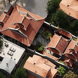
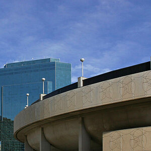
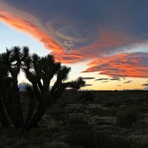
What do you guys think, does the color balance look good? I upped the contrast a bit too:
Before:

After:

Before:
After:
![[No title]](/data/xfmg/thumbnail/42/42456-a5a32b76e115de404d99d09173cd71f2.jpg?1619740191)
![[No title]](/data/xfmg/thumbnail/35/35664-428352d20c8015248f9625e246c3581c.jpg?1619737089)
![[No title]](/data/xfmg/thumbnail/42/42454-2589290b654fa7e0ffdd794aaa5cbd86.jpg?1619740190)
![[No title]](/data/xfmg/thumbnail/41/41759-f0f73c457ebcb6dabcbddc7a3c000487.jpg?1619739884)