first try at black and white

just x joey

TPF Noob!
Joined
Jan 20, 2007
Messages
946
Reaction score
1
Location
Ocean City, MD
Website
joeydsmith.com
Can others edit my Photos
Photos NOT OK to edit
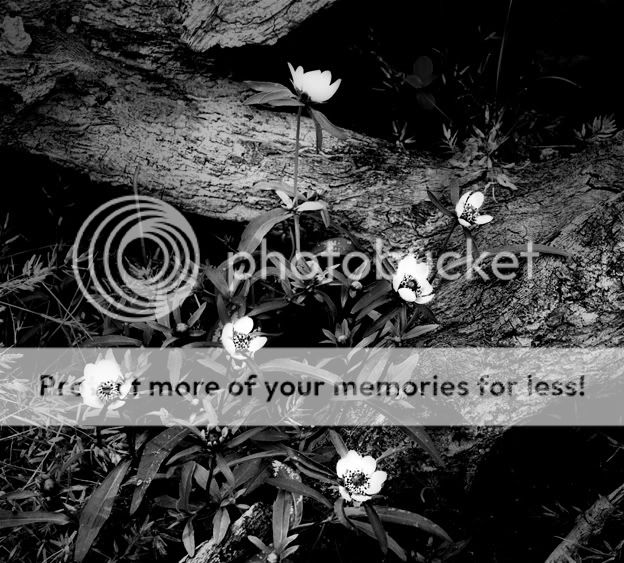
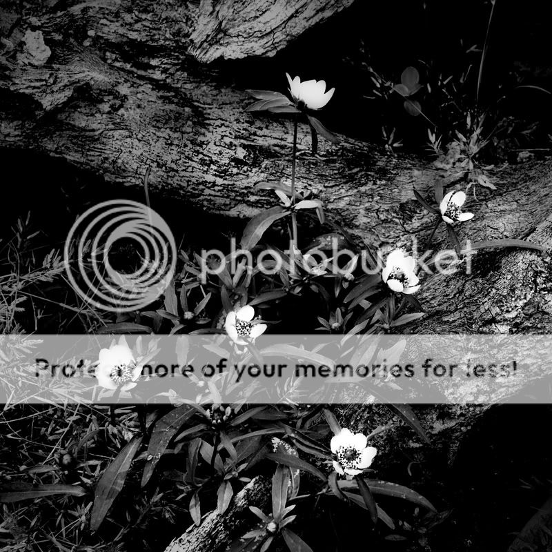
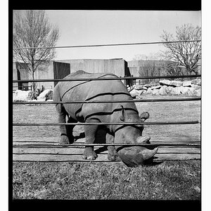
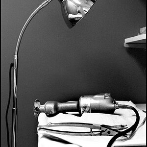
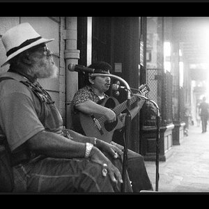
this is my first try at black and white, im tryn to get into it so i can start framing prints for my family and friends to hang on their walls and stuff.
comments and criticism please!!!!:hug::
blossums.jpg
 
The flowers are pretty. I like the contrast in it.

You are in college, no? I usually avoid your posts because your spelling and grammar make me want to stick rusty forks into my eyes. I honestly mean that in the nicest and most constructive way possible. I think you'd get more response if you made an effort to improve on that front - it would make you seem much more professional, even here where people are very informal.
 
Yes, I am in college, community college though! Haha. Maybe that's why my grammar is so bad. Well thanks for the info, i will do my best to make more professional posts. I was wondering why i don't get any feedback! :)
 
i'm not sure this image is best suited for B&W, i think the color version might be stronger. Not sure what color the flowers are, but they would probably pop better in color. The detail in the flowers are all blown out and it appears as just white splotches across the landscape.

the bark in the top left quadrant of the photo looks a little soft and is possibly over exposed as well... the bark in the right half is quite sharp and has a lot of detail... composition wise it's not bad.
 
unfortunately i didn't take it in color :x i should have burned the bark in the left like your talking about. but i just ordered a 10x10 print. thanks for the comments, i'm trying to work on my B&W photography, does this look better?

blossumsfull.jpg
 
This photograph does nothing for me. As meotter pointed out, the flowers are completely blown out. Everything else is almost the same tone of gray. It's flat, and boring. Additionally, the composition is confusing -- my eyes don't know where to go. In most good pictures, either the lines in the photo should lead the eyes, or the subject matter should stick out in some way to distinguish it from the rest of the picture.

Keep taking pictures, and keep thinking about how you bring out what you want the viewer to focus on in your pictures.
 
agree, now i wish i didn't order a print, as its not really print worthy, thanks for all the criticism. makes me motivated! i got it for my grandma, im shure she will enjoy it even tho its bad :)
 
Please refrain from posting your photos all over the place. This photo is showing somewhere else, too, where you are getting ample comments, and I am now going to find the other and merge the two threads, to declutter our forums. Is that ok with you? I would think so.
 
I was showing it in the gallery cause i was proud of it and showing it on this forum for critical analysis. sorry!
 
The flowers are pretty. I like the contrast in it.

You are in college, no? I usually avoid your posts because your spelling and grammar make me want to stick rusty forks into my eyes.

You made me choke on my coffee :lmao:
 
Newbie here, but here's my opinion anyway!! LOL!!! ...I actually like some flower photos in B&W (and I do like this in black and white)!! I think this photo is quite good, but as someone else said...the flowers are a little blown out.

Great job!!! ....I'm sure your granny will love it!

:O)
 
The flowers are pretty. I like the contrast in it.

You are in college, no? I usually avoid your posts because your spelling and grammar make me want to stick rusty forks into my eyes. I honestly mean that in the nicest and most constructive way possible. I think you'd get more response if you made an effort to improve on that front - it would make you seem much more professional, even here where people are very informal.


Anybody seen the film "Sideways"? I just sharted.
 

Most reactions

Back
Top