Foggy Night

albo

TPF Noob!
Joined
May 11, 2005
Messages
27
Reaction score
0
Can others edit my Photos
Photos OK to edit
Hi folks..

foggysign.jpg


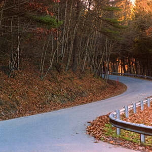
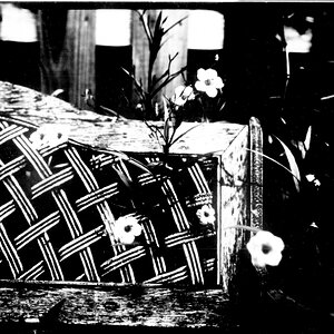
Wondering what I could have done to improve this.. I know that it's very blurry. I saw this scene and liked it, but it was a rare opportunity of a foggy night and I didn't have my tripod... Had to use my car to steady the camera and even then had to hold it at an angle (I could only lean the camera on the car, not let it rest)... Then had to take it in a hurry as I was parked in the way of any car that might come along!
But any comments other than the blurriness would be great...

Panasonic Lumix DMC FZ20
ISO-100
Auto-Focus
Afraid I can't remember the aperture / shutter...
 
The mild blurriness goes well with the fog. So that is a minor worry only, less even after you described how you took this photo.

I am sure this funny ... :scratch: ... thing (signposts?) in the middle is what caught your attention in the first place? And it looks eerie with its oblong shadow and the wide-spread street light which shines through the fog. I do see why the scene attracted you!

But I feel that ... erm, yeah, funny thing ... is too much in the middle. Therefore, if this were mine, I'd crop off some of the dark part on the right, that will automatically move the thing to the right and out of the centre.

Test out if that alone will help?
 
OK, so... Here it is...

foggysign1.jpg
 
Thanks guys... it does look better that way, but why does it look better with the main feature to the side, I wonder?
 
I don't know WHY this is so, but even painters who painted their canvasses hundreds of years ago already found out that it is more pleasing to the eye.
 
that's pretty nice picture if i was in a foggy night like that i would take more picture excelent image
 
Thanks guys... it does look better that way, but why does it look better with the main feature to the side, I wonder?

This particular image looks better because the shadow the main subject casts leans to the left from the viewer's perspective. By having the main subject off to the right some the shadow leans toward the center of the image and doesn't lead the eye off to the side but rather keeps the eye centered. Also removing the dark bushes on the right helps the overall image quite a bit.
 
I feel the original picture looks much better, although it is often the best idea to have your subject off center it is not an unbreakable rulle. the first pictures allows the light to be full and more dramitic, also to the right of the tree can be seen adding more to the feel of the whole place.
 
2nd picture is better.
1st pics shows off "night" only, 2nd pic shows off "foggy night".
Many rules are testified again and again....
 
I actually like the first one because it just seems to have more atmosphere to it. The lighting is amazing and I understand that many rules are tried and true but they are also made to be broken at the right time. Just my opinion.
 
Another possibility...

foggysign.jpg
 
Wow that really works! I actually now think this latest effort is the best of the lot.
 
In certain photos blurriness works... I think with the feel of this photo if it were crisp and sharp it wouldn;t look as eerie. I personally like it without the cropping because it adds more of that eerie feel, but I do agree that off setting something to the side normally improves the quality of the photo. Nice Job on this one in my opinion....
 

Most reactions

New Topics

Back
Top