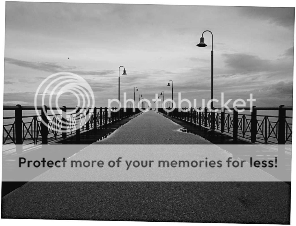
Footbridge into the sea

This kind of shot depends on the perfection of the geometric elements and the impact of the few things there are to look at.
This shot has nice geometricity but there are, imo, some ways it good be improved.
It looks to me like the shot is rotated slightly.
I would separate the roadway and sharpen that with local contrast enhancement to give it some texture and not the flat grey area it is now.
Then I would increase the contrast overall (to your taste) to give it some dynamism.

an example
8066462916_d26c353871_blll2222222.jpg

I hope this is of interest.

Lew
 
View attachment 22239
Here's my take. Overall brightened and bumped up the contrast and slightly sharpened. Maybe it's just a personal preference. See what others think.
 
I would go somewhere between Lew's edit and Rick's. It depends on the mood you want. I would also crop some foreground so that the bottom of the railings is near the lower edge.
 
Four individuals. Four ideas of how the image should look. It all boils down to personal taste.


BTW, good catch on the rotation Ken, you can see where the boardwalks meet the edge of the frame, something's not level.
You also notice that the handrails split the frame all most exactly in half. In this case I think it works.
 
Last edited:
Awesome!
That local contrast enhancement is a great idea and good job on seeing the rotation. I didn't notice that.

Thanks for the suggestions!


Greetings,
Matthias.
 

Most reactions

Back
Top