mcoppadge
TPF Noob!
Alright, well, basically I'm just looking for a "which version is best" or "which ones do you think are worth keeping"? I took this shot and messed around with it a bit and I got a couple of different results. I apologize if any of the images are very large--something is either screwed up with the upload or my computer.
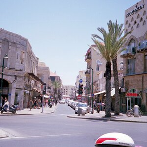
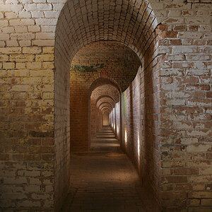
Here is the original:

Here is a version that I particularly like, mostly because of the color. What I'd like to know, from an objective perspective, is "Is it good?" I like the color but it may make for a horrible picture from someone else's POV.

Here is a B&W of the same thing that I also feel is a fairly decent version:

And finally, my "'Dark Side' Version", which I would like more if it was better quality--a lot of it was lost in the PSing. I guess it still makes for an okay image, but tell what you think just the same.

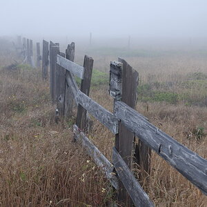
Here is the original:
Here is a version that I particularly like, mostly because of the color. What I'd like to know, from an objective perspective, is "Is it good?" I like the color but it may make for a horrible picture from someone else's POV.
Here is a B&W of the same thing that I also feel is a fairly decent version:
And finally, my "'Dark Side' Version", which I would like more if it was better quality--a lot of it was lost in the PSing. I guess it still makes for an okay image, but tell what you think just the same.


![[No title]](/data/xfmg/thumbnail/38/38735-2245cc1b04db3f96fa74095ae14558a6.jpg?1619738703)