Fun photoshoot with of my girl (C&C welcome!)

commissionedsk

TPF Noob!
Joined
Feb 5, 2011
Messages
20
Reaction score
0
Location
Sacramento, California
Can others edit my Photos
Photos OK to edit
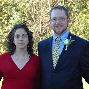
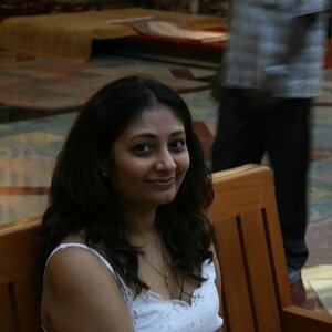
I discovered a new part of town the other day...so my girlfriend and I decided it would be an awesome spot to take some fun pictures. :) since business has been slow...it was a nice way to just have some fun with portraits again. C&C is welcomed and appriciated.

1.
DSC_0280bw.jpg


2.
DSC_0312boost.jpg


3.
DSC_0322boost.jpg


4.
DSC_0333boostlogo.jpg
 
SWEET BABY JESUS! #3 is horrid. delete immediately! it's so unflattering, it looks like as if she's aged to 60 years old. The lighting (or lack thereof?) makes this image so bad, it brings out a lot of imperfections in her skin. Of course, not saying she needs a plastic-smooth face like Barbie, but I don't think she'd like this photo, herself.:meh: Plus, the image is just overwhelmed with the orange and red tones all over.
Think about composition more.

(are these straight of the camera or have you edited them as well?):meh:

#4, her face is at the status of a tomato and her skin is all blown out. it also seems as if though the focus is on the bricks above the "basic".

I'd say #2 is the most "okay" one, although it's quite uninteresting.

#1 is way too constrasty, look at the loss of detail in her skin and hair.

*hope you do not take any offense to my opinions and suggestions, i know some people have thick skin when it comes to photos of their children / counterparts. :thumbdown::er:
 
I have to agree with Sbuxo... Not a very good set. Looks like you shot in the mid day sun... The shadows are so hard and unflattering.
 
I think a reflector could have really helped these shots out. Getting some light on her face and reducing the harsh light/shadows would make these much better. They look a little soft to me too. I like the idea of #3 the most.
 
I have touched them up some...I guess maybe its a difference in style...I tend to like harsh contrasts when it comes to just pictures i'm taking for fun...professional stuff is different...but I would agree that #3 needs some color readjustments...It was too cold...but looks now like I went alittle too warm...lol. It was midday sun...frustrating...I don't have a reflector right now...somewhere between moving across country and changing apartments 2 times I seem to have both of mine...and don't have the money for new ones just yet. Thanks so much for your comments. Any thoughts on the composition?
 
C&C per req:

1. Does not display.

2. Angles are a matter of preference; I tend not to like them. The image itself appears soft on the subject, and it looks like your point of focus was in fact the wall lower image right. The background really kills this one; a large aperture and OOF background helps to some degree, but there is still way too much detail visible which competes with the subject. Avoid cutting little bits of people, such as the end of her left foot. If you must crop limbs, do it boldly and not through a joint on along the limb's axis.

3. The harsh lighting would be more acceptable here, IMO, as an artistic technique were it not for her hair-colour and complexion being so similar to the background. This is akin to having a portraiture subject wear a black suit and then using a black background. I think this one would be stronger if it were cropped square and the empty space image right eliminated.

4. Again, the face appears soft in this image. I think a slightly different composition to eliminate the open space image far left would have helped. Always be aware of, and correct things such as the exposed bra-strap.

Just my $00.02 worth - your mileage may vary.

~John
 
I tend to like harsh contrasts

Sorry but harsh contrast on portraits is almost never attractive. The shadows in these photos don't do her any favors at all. #3 especially makes her look about 25 years older than she appears to be from the rest of the photos. Color adjustments won't save her in that one.
 
#3 and #4 they look like different persons. She looks way younger in #4. Lighting is too harsh. For me if I had to choose among the 4 ... The fourth one would be it. Focused on her face more then the sign and shoot in the afternoon sun around 4pm it would give you a nice warm tone. IMHO
 
I'm surprised it hasn't already been said...but I think the squinting eyes and the funky face she has on is killing #2 for me. She looks extremely uncomfortable...and armless!!
 

Most reactions

New Topics

Back
Top