KevinDks
TPF Noob!
- Joined
- Jul 9, 2007
- Messages
- 158
- Reaction score
- 0
- Location
- Burley, Hampshire
- Can others edit my Photos
- Photos OK to edit
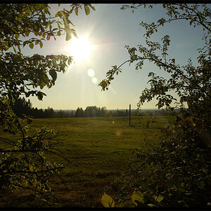
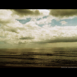
So, I bought a dSLR and the results have looked very good on my screen, but browsing through the galleries here I came across this:
http://www.thephotoforum.com/forum/showthread.php?t=88060
The picture in that thread looks dark to me and to a number of people who have replied. The original poster says that his monitor is calibrated, and that to him it looks exactly the way he wants. I've Googled 'gamma' and realised that there is a whole new world of complexity that I didn't know existed, much less understand...
I use a new Compaq laptop with Windows Vista, and I have an Iiyama LCD monitor that I can use to extend my desktop. The graphics settings on the PC look like this:

These are the default settings and everything looks fine - good contrast, bright colours. If I change the gamma to 1.8 (Google tells me that is the Mac setting, presumably what the OP is using in that thread) the picture looks much brighter, but everything else on the site appears too light and washed out. If I set it to 2.2 the effect is much the same.
I'd quite like to share some photos here, but I'm more concerned about printing. The service I want to use has Fuji Frontier printers, and as far as I can work out I need to calibrate my monitor so that what I see on screen matches the final print. Is it normal to use one monitor setting for viewing on the web and another for editing files for printing? Do people create two versions of photos they want to print and show on a website?
Kevin
http://www.thephotoforum.com/forum/showthread.php?t=88060
The picture in that thread looks dark to me and to a number of people who have replied. The original poster says that his monitor is calibrated, and that to him it looks exactly the way he wants. I've Googled 'gamma' and realised that there is a whole new world of complexity that I didn't know existed, much less understand...
I use a new Compaq laptop with Windows Vista, and I have an Iiyama LCD monitor that I can use to extend my desktop. The graphics settings on the PC look like this:
These are the default settings and everything looks fine - good contrast, bright colours. If I change the gamma to 1.8 (Google tells me that is the Mac setting, presumably what the OP is using in that thread) the picture looks much brighter, but everything else on the site appears too light and washed out. If I set it to 2.2 the effect is much the same.
I'd quite like to share some photos here, but I'm more concerned about printing. The service I want to use has Fuji Frontier printers, and as far as I can work out I need to calibrate my monitor so that what I see on screen matches the final print. Is it normal to use one monitor setting for viewing on the web and another for editing files for printing? Do people create two versions of photos they want to print and show on a website?
Kevin
")


![[No title]](/data/xfmg/thumbnail/37/37116-fdf3127b1d8834c25461dd2d201c031c.jpg?1619737883)


![[No title]](/data/xfmg/thumbnail/37/37117-26c892e756b53ed0359fa90b7ebd99c9.jpg?1619737883)