Garlic B&W

LittleMan

TPF Noob!
Joined
Dec 14, 2004
Messages
6,648
Reaction score
141
Location
Texas
Website
www.sorberaguitars.com
Can others edit my Photos
Photos OK to edit
garlic.jpg


garlic2.jpg


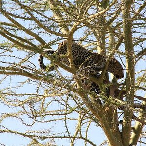
I would like to know what y'all think... Which one is better?(they are both the same photograph only cropped differently)
How could I improve?
Please give me some feedback. Thanks!:)
 
I prefer the tighter shot, there's a really nice range of contrast in it, and I don't think the wood surrounding the pile of garlic cloves adds much.

But, the tighter shot loses something because you can't really tell it's a knife. I think you could make the photo even better by rearranging it so you could see the tip of the blade in the tight photo.

Hope you didn't try to kiss anyone after that lot :wink:
 
andycarnall said:
the tighter shot loses something because you can'treally tell it's a knife. I think you could make the photo even betterby rearranging it so you could see the tip of the blade in the tightphoto.
I will try that when I have some time on my hands... Maybe even if I use a smaller knife? That might look better..

Hope you didn't try to kiss anyone after that lot :wink:
Na, no one around to kiss... lol:wink:
 
the texture/ grain of the cutting board adds a very nice contrast to the cut garlic, and provides context. that is lacking in the crop, so i like the more inclusive image better. nice work.
 
First one for me, too. There's an old adage which says that if your photo's bland you just didn't get in close enough, but for me the second crop is too busy and difficult to identify what your looking at without the aid of your thread title. Maybe the only way you could improve the top one is to have included either an unchopped or only partly-chopped garlic clove in the space in the bottom left of your photo, so that without your thread-title the viewer could easily see that the photo was obviously of chopped garlic-cloves
 
John Orrell said:
First one for me, too. There's an old adage whichsays that if your photo's bland you just didn't get in close enough,but for me the second crop is too busy and difficult to identify whatyour looking at without the aid of your thread title. Maybe the onlyway you could improve the top one is to have included either anunchopped or only partly-chopped garlic clove in the space in thebottom left of your photo, so that without your thread-title the viewercould easily see that the photo was obviously of choppedgarlic-cloves
Oh, yes.... that is a very good idea..:mrgreen:
 
I like both compsitions. The top looks like its got to many hot spots but the cutting board really adds texture and atmosphere. The second photo you mentioned keeping the tip only of the blade so you could identify with it. Why not let the handle and the blade be in the photo. I would make both the handle and blade run off the edges though. The handle would really let you understand what your looking at.
 
Love the top one - all the slash marks on the cutting board lends a great feel to the image. The knife looks great. I'd agree with the comment about adding an untouched garlic glove somewhere, so there can be no doubt about what is getting chopped here.

Meanwhile, I have a sudden urge to find the tomatoes, basil, pasta, and a bottle of red wine! :D
 
I love the second one. The post above I agree with. I can't tell it's a knife when it's that close. Maybe using the tip would be best for the tight shot :) or handle?
 
LittleMan said:
I will try that when I have some time on my hands... Maybe even if I use a smaller knife? That might look better..

you always have time on your hands ...lol
 
I prefer the second one. The top one does include the texture of the wood but I think there is still too much uneeded space in the shot. The second one has a better feel and I don't think it's a huge stretch to realize that's a knife in the shot. Maybe a compromise of the two would work?
 
I apologize if I re-iterate some already made comments, you seem to have a lot of fans for this photo.

I prefer the first shot. It has a very classic look to it. The tighter version could be excellent but needs some compositional changes, as was mentioned about with the knife, etc.

Regarding the first photo, however. I am very pleased with the lighting. I like the reflection play on the knife and that it isn't uniform, it makes the eye move. I also like the direction the light is coming from, sort of backlighting the glarlic. It really works well to bring them out in the black and white.

I really like this photo and aside from the above lighting reasons, I can't really put my finger on why. :)
 

Most reactions

Back
Top