johngpt
Been spending a lot of time on here!
- Joined
- Apr 27, 2008
- Messages
- 5,204
- Reaction score
- 3,159
- Location
- Albuquerque, NM
- Website
- www.flickr.com
- Can others edit my Photos
- Photos NOT OK to edit
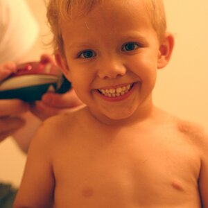
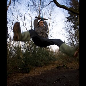
I had been trying to capture lightning of the storm across the park. It began sprinkling. I leaned around to check the lens for raindrops, and what the heck, pressed the shutter. The snap was so goofy, I had to retouch it and post it in the self portrait thread. Then decided that because it was a lot more work to retouch than anticipated, I'd post here as well.
Here's the retouched image.

Now here's the original.

I didn't bother leveling the horizon. Just wasn't interested enough. Nor was I interested in later enhancing contrast in the sky. I just wanted it to be more presentable.
Here's a screenshot of the layers palette.
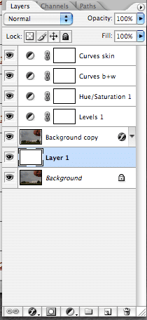
Layer 1 actually came last. First there was the Levels layer to bring the right slider more toward the first highlight pixels, and slide the gamma slider to the left to bring up the mid tones. Also in the output boxes, white was lowered to 250 from 255, and blacks were raised from 0 to 5. Old habit from when I'd print everything.
Next came the hue/saturation layer, using a technique learned from Lee Varis' book: Skin. Click on Master and call up Reds. Click on an area of the image which is way red. Then choose the 'minus' eyedropper tool, and click on an area that's pretty good. Drag the hue slider all the way to the left to get it very purple/blue. At the bottom of the dialog window, drag the right triangle left to decrease the area that'll be primarily effected. Then drag the hue slider to the right, past its starting point, and a bit further, watching the info palette and the general look of the image. This does a great job of bringing things more balanced rather quickly. But there were still problems.
Next came the curves adjustment layer for the black and white points. Used the color sampler tool, and placed a marker on one of the house's skylights, to have section in the info palette to watch. I didn't bother with setting one for the black point. Just wasn't interested for this one. Open the curves layer dialog window. Select Blue, Green, and Red channels individually, to make the one point on the skylight neutral by dragging the topmost point of the diagonal line so that the R, G, B values are all equal, therefore neutral.
Now, the second curves layer was used to make a point on my face more color balanced. The info palette, on the CMYK side showed excessive cyan, excessive magenta, and excessive yellow. So monitoring that particular point, used the Blue channel to increase blue to decrease yellow, then the green channel to increase green to decrease magenta. Had to go between the channels to get the magenta just slightly less than the yellow, and the cyan about one-third to one-half the value of those. Also had to go back and readjust the white point with the other curves layer just a bit too.
The rationale and technique comes again from Lee Varis' book: Skin.
That was basically it.
The background layer was copied to decrease its size. A new blank layer filled with white was placed between the two background layers. Transform was used to make the background copy smaller and let the white layer show.
Drop shadow was used on the background copy. The white layer was selected, brush set to black, 15 pixels, hard edged. On the Paths palette, clicked the button for create new path. Clicked the button for stroke path from brush.
So, that's my story and I'm stickin' to it. :mrgreen:
Here's the retouched image.
Now here's the original.
I didn't bother leveling the horizon. Just wasn't interested enough. Nor was I interested in later enhancing contrast in the sky. I just wanted it to be more presentable.
Here's a screenshot of the layers palette.
Layer 1 actually came last. First there was the Levels layer to bring the right slider more toward the first highlight pixels, and slide the gamma slider to the left to bring up the mid tones. Also in the output boxes, white was lowered to 250 from 255, and blacks were raised from 0 to 5. Old habit from when I'd print everything.
Next came the hue/saturation layer, using a technique learned from Lee Varis' book: Skin. Click on Master and call up Reds. Click on an area of the image which is way red. Then choose the 'minus' eyedropper tool, and click on an area that's pretty good. Drag the hue slider all the way to the left to get it very purple/blue. At the bottom of the dialog window, drag the right triangle left to decrease the area that'll be primarily effected. Then drag the hue slider to the right, past its starting point, and a bit further, watching the info palette and the general look of the image. This does a great job of bringing things more balanced rather quickly. But there were still problems.
Next came the curves adjustment layer for the black and white points. Used the color sampler tool, and placed a marker on one of the house's skylights, to have section in the info palette to watch. I didn't bother with setting one for the black point. Just wasn't interested for this one. Open the curves layer dialog window. Select Blue, Green, and Red channels individually, to make the one point on the skylight neutral by dragging the topmost point of the diagonal line so that the R, G, B values are all equal, therefore neutral.
Now, the second curves layer was used to make a point on my face more color balanced. The info palette, on the CMYK side showed excessive cyan, excessive magenta, and excessive yellow. So monitoring that particular point, used the Blue channel to increase blue to decrease yellow, then the green channel to increase green to decrease magenta. Had to go between the channels to get the magenta just slightly less than the yellow, and the cyan about one-third to one-half the value of those. Also had to go back and readjust the white point with the other curves layer just a bit too.
The rationale and technique comes again from Lee Varis' book: Skin.
That was basically it.
The background layer was copied to decrease its size. A new blank layer filled with white was placed between the two background layers. Transform was used to make the background copy smaller and let the white layer show.
Drop shadow was used on the background copy. The white layer was selected, brush set to black, 15 pixels, hard edged. On the Paths palette, clicked the button for create new path. Clicked the button for stroke path from brush.
So, that's my story and I'm stickin' to it. :mrgreen:
![[No title]](/data/xfmg/thumbnail/34/34347-8b81549fefc38aca163688d07a9f5ced.jpg?1619736384)
![[No title]](/data/xfmg/thumbnail/32/32930-09414fc020c2a60a456ff59a05c5ef8f.jpg?1619735759)