Greetings. Cards. Greeting cards. Oh, and C&C.

Tight Knot

No longer a newbie, moving up!
Joined
Nov 30, 2010
Messages
1,398
Reaction score
159
Location
Boca Raton, FL
Website
www.lensphotoworld.com
Can others edit my Photos
Photos OK to edit
Hi everyone,

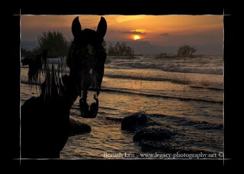
Looking for some feedback on a few greeting cards I'm working on. I would love to hear your feedback.

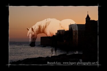
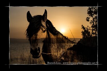
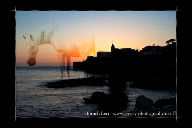
The horse ones are for sympathy cards (any other uses you can think of?) and th4e rest, well, I believe they're self explanatory :allteeth:.
 

Attachments

  • 1 horse head on sunset over Kineret - plus border.jpg
    1 horse head on sunset over Kineret - plus border.jpg
    167.2 KB · Views: 114
  • 2 horse heads on sunset over Har Bental plus border.jpg
    2 horse heads on sunset over Har Bental plus border.jpg
    160.7 KB · Views: 102
  • Horse on Sunset over Akko port and Church plus border.jpg
    Horse on Sunset over Akko port and Church plus border.jpg
    108.7 KB · Views: 116
  • Horse with straw in mouth over Kineret sunset - plus border.jpg
    Horse with straw in mouth over Kineret sunset - plus border.jpg
    157 KB · Views: 123
  • Horse on Sunset over waters of Akko port - horse faded - plus border.jpg
    Horse on Sunset over waters of Akko port - horse faded - plus border.jpg
    118.5 KB · Views: 102
  • Cheers - champagne and glass with snow - black border.jpg
    Cheers - champagne and glass with snow - black border.jpg
    238.9 KB · Views: 101
  • Happy Holidays - champagne and glass with snow - black border.jpg
    Happy Holidays - champagne and glass with snow - black border.jpg
    244.4 KB · Views: 121
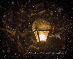
  • Winter - Lamp in the snow at night.jpg
    Winter - Lamp in the snow at night.jpg
    251.3 KB · Views: 189
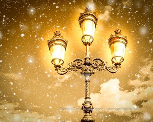
  • Winter - Lamp post in the snow - Dublin, Ireland.jpg
    Winter - Lamp post in the snow - Dublin, Ireland.jpg
    310.7 KB · Views: 181
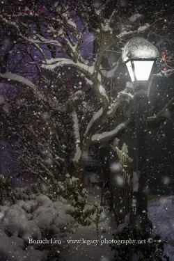
  • Winter - Light on post with fence and tree with berries in snow at night.jpg
    Winter - Light on post with fence and tree with berries in snow at night.jpg
    238.1 KB · Views: 114
Sympathy card are nearly always bright and cheerful, not dark. The reds and predominant blacks in yours and especially the one with the two heads don't really project the sort of image that sells well. You don't really send get well soon messages of a sunset combined with the riders of the apocalypse as your message may be mis-understood. ;)

Also I do not see or understand why you have combined two images that bear no relationship to each other either in shape, colour, context or composition. Why is there a horse looking at me while I gaze at the sunset over the surf? Why is there a ghost of a horse standing on a foreshore and what is its relationship to the location? (Why are you sending me a sympathy card with a picture of a ghost? ;))

You also need to look at the colours on all of them. Black is for mourning, red is for fire and passion, see where I'm going?
Lamp post with snow, why is the sky that colour? The yellow/orange glow of the lamplight against blue and white of snow in the sky (their usual colours?) would work as a colour theme, snow falling from a dirty orange sky doesn't work on so many levels. ;)

You really need to look at basic colour theory. In a small card you need to be able to produce something that is visually pleasing, something with a clear message, and something that is visually balanced.
You also need to understand your processing as you are over-saturating the colours through saturation/vibrance/contrast controls. These are not easy to reproduce in a printing process.

The happy holidays for instance is predominantly dark and black, the white champagne bubbles are near black! Every other colour is either fully saturated or close to full saturation and so will be difficult to reproduce. With so much saturated colour in the image you may ask yourself why it looks so dull and colourless, you may ask why anybody would associate "happy" with so much black? ;)

Greetings cards are mass market items. You need to be simple and precise with your message, and simple and precise with your design. Your colours need to be proofed and in gamut of the volume printing process to be used. Print your's out and place them with your christmas cards as they would be in a shop. Which would you buy?

Sorry. :(
 
Last edited:
Hi Tim,

First of all thank you very much for your detailed, open, honest and candid critique.

I'm not sure that I agree with everything you said, I'm going to have to spend some time doing more market research (and getting my ego out of the way :eek::allteeth:). But either way, your comments certainly help to keep my eyes open, and hopefully on the right track.
I'll post back once I've had more of a chance to study your critique in depth.

Thanks again,

Bruce
 
I'm going to have to agree with Tim. As someone who buys a lot of cards, I dislike all of these except for maybe the winter lamp post in the snow. The first one of the horse just looks odd. And the font on the two, just looks amateur. I know there is big business in greeting cards. But these, I don't think make the cut.
 
I'm going to have to agree with Tim. As someone who buys a lot of cards, I dislike all of these except for maybe the winter lamp post in the snow. The first one of the horse just looks odd. And the font on the two, just looks amateur. I know there is big business in greeting cards. But these, I don't think make the cut.
Hi Barb,

Thanks for the feedback.
I guess with every new venture, there comes a learning curve, and in this case it appears like a rather steep one. I'll have to keep trying and will post more as time goes by to get more feedback. Other than the things Tim mentioned, and the font issues, is there anything else you see that could/should be changed or done differently?

Thanks,

Bruce
 
I think Tim nailed it pretty well. I don't like the lump of snow on the light post. It actually took me a bit to figure out what it was. For sympathy cards, something a little brighter and an image that is clearer would be my preference. Something peaceful instead of dark and see through horses.

Other than that, I think Tim's advice is pretty spot on.
 
Hi Barb,

Thanks for your insight.
Not that it necessarily makes it any more marketable, but the horse cards, were aimed at the horse owner crowd who have lost a horse, and I figured that it would resonate with them.
Maybe I should show them to some of my horse owning friends (and have them laugh at me :) ) to see what they think .

Sent from my SM-G920P using Tapatalk

Look at sympathy cards and you will find that they nearly all use pastels and towards cool/calming colours. If you look at the motives and symbolism you will also find them to be uplifting or comforting with reference/motion upwards.
Reds are associated with fire, passion and anger. The setting sun goes down, goes out, it signifies the coming of dark and danger.
Remember if you send a card of sympathy it's nearly always to someone you don't know intimately and you want to be absolutely sure that your message is clear and won't upset.

I think that your image re-posted below is the best by far, but look at the image. Bare leafless trees, passionate dark angry colour, the sun setting... If your horse is still alive it's excitement and danger, but I wouldn't send it to someone who's horse has just died. ;)

Below it is an image I took of "Kiss" and processed for my partner after Kiss had to be put down following a freak accident. I include it not because I think it is better than yours, but because it is the opposite of yours. Although your images show that you know your way around image editing, all of you images also show the effects of only positive movement of those contrast/clarity and saturation controls. Heavy contrast, increased black, and saturated colour. My image is all about soft contrast and you'll be hard pressed to find any colour in it above 50% saturation.

Which is the most exciting, and which is the most comforting?

Download mine and compare it against all of yours and you'll see how all your images are similar in saturated colour, heavy contrast and increased black content.

2 horse heads on sunset over Har Bental plus border.jpg


_DSC5246_sRGB_sm-tighter crop.jpg
 
I hear. There's a lot more psychology that goes into this than I gave it credit for. Stupid me. Makes a lot of sense.
Thanks a bunch for your help.
Cheers.

Sent from my SM-G920P using Tapatalk
 
I like hers. Except for the rainbow one. But if you'll notice, although the horses are dark in hers, there is light as well. And the horses are clearly defined and fit into the scene. It's places where you would actually find horses. I find a few of them a tad dark but overall, they are nice.
 
I like hers. Except for the rainbow one. But if you'll notice, although the horses are dark in hers, there is light as well. And the horses are clearly defined and fit into the scene. It's places where you would actually find horses. I find a few of them a tad dark but overall, they are nice.
What would you recommend I change with the fonts?
 
Hi Tim and Barb,

Based on the previous posts, I would love to hear your opinion on this site. It is not mine, but apparently, this lady is quite successful with her greeting cards.

http://www.allpetcards.com/equine-sympathy-cards

I really like the clever use of silhouette, very effective and smart!

Though I'm still not sold on the use of sunsets, (there are some sunrises there), if you look you will see that they are all calm and peaceful settings.

Another thing that I notice is that in all the silhouettes the horses are shown against the bright part of the sky, they are clear and precise. Look at your horse with straw, it's two completely different patterns of black overlaid on one another and in doing so you have created only confusion. Why has the horse got horizontal stripes?
The placement of the horizon in all but one is in the bottom third of the image, you are looking up.
Look at the control of tone and colour. In the silhouettes is the black of the silhouette repeated in any other part of the image?

These are just some of the things I notice and are all basic design considerations, as is the font. Which becomes easier when you realise that words are pictures as well.

I'm really not trying to put you down, only point out that in a greetings card you need a rudimentary understanding of art, design and colour. Nothing too fancy just the basics.

With your processing I'm making assumptions so please excuse me if I'm wrong. In all your images I see the same thing, subtractive processing, increasing contrast, clarity, saturation. All these things remove information from your image. Nearly all the shapes in your images are defined by black, nearly all of them have a limited and thin palette of colour. You process for drama because that's the only way this method can go as it removes the indicators of peace and tranquility which are softness, smoothness, brightness, etc. Not really suited to sympathy cards. ;)

When I posted my image I did so to show you the opposite as there is very little black in the image and no saturated colour, just a rich balanced mix of pastels tints and tones. Notice the smooth gradations in tone and that not one shape is defined by black. Have another look at the cards you linked to and in the backgrounds of the silhouettes you will see the same thing, there's a rich mix of balanced colour with smooth gradations in tone. You need to understand and control colour a lot better than you are at present.
Have you calibrated the brightness of your monitor or is it turned way up? As I'm not really sure you're seeing how dark your images are.
 

Most reactions

Back
Top