Gring's Mill: Reading, Pa

Rick58

Been spending a lot of time on here!
Joined
Jun 23, 2012
Messages
4,227
Reaction score
1,473
Location
Reading, Pa
Can others edit my Photos
Photos OK to edit
GringsMillRdgPaweb_zpscd5492a5.jpg

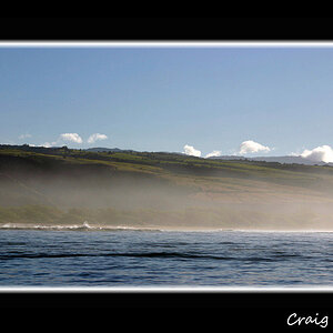
Grings Mill, Reading, Pa
Still fighting Mother Nature and her ever gray sky.
Please leave all thoughts comment and Critque
 
Last edited:
Thoughts would be that you have a good range of tonality from near white to near black. Any more contrast and the sill would be a wash and you lose detail in the pine behind and above the roof.

Looks like you nailed it dead on. Gear, exposure, processing notes? Just curious.

Looks beautiful.
 
Please leave all thoughts comment and Critque

I like the subject matter, and am wondering if you have a wider shot of this place? Wide enough to catch the left edge of the building and tall enough to get more of the reflection.
 
Same as Designer. The tonality here is good Rick.
 
agree with above. Beautiful shot.
 
Gear, exposure, processing notes? Just curious.
QUOTE]
Thanks...

Nikon Df
50mm
ISO 200
1/125 @ f11

As far as processing,
Straighten
Crop
Desaturate
Adjust the histogram
Tweak the highlight/midtone/ shadows
One or two clicks of tone mapping
finish off with curves until I got the look I wanted
 
Please leave all thoughts comment and Critque

I like the subject matter, and am wondering if you have a wider shot of this place? Wide enough to catch the left edge of the building and tall enough to get more of the reflection.
Thanks...Cropping was definitely selective
Against the left side of the building are modern vehicles and snow removal equipment. Instead of running the edge of the building down the left side of the frame, I opted to crop hard.
Cropping higher to capture more of the tree just washed out the image with a huge dead sky.
 
Why BW Rick? I would love to see it in color version.
 
Why BW Rick? I would love to see it in color version.

That's the root of the "over rated B&W" controversy. For me it was never a option.

It's the tones of the forground rocks against the water
It's the refelections in the water
It's texture of the raw stone against the white painted windows.
It's the dark shadows in the background

For me anyway, B&W is a feeling or an emotion. It's hard to explain
 
It's the same for me. If tomorrow all the digital cameras would be able to shoot only BW that would'nt be a problem for me. But if they could shoot only in color I would quit photography.

That was just a curiosity. I think when you first saw the scene, probably colours pleased your eyes too.
 
I think when you first saw the scene, probably colours pleased your eyes too.
Actually I take very few "serious" color shots. I see the shot in B&W before I even press the shutter, but that's what interests me.
Sunsets are pretty and I enjoy seeing images done by others, but I can't tell you if I EVER took one myself.
 
The gray skies worked in your favor again, Rick, especially for a B&W conversion. The blacks and whites are clean; it was worth coming back for a second look!
 
The blacks and whites are clean; it was worth coming back for a second look!
Thanks, I'm pretty happy with the results. At first I was disappointed with the vehicles parked along the building, but I now like this crop. Your mind fills in what's missing. I purposely cropped the water reflection. For me, full mirrored water reflections are way too over done. Almost nauseating. Again, we know what follows outside the frame.
 
Last edited:

Most reactions

Back
Top