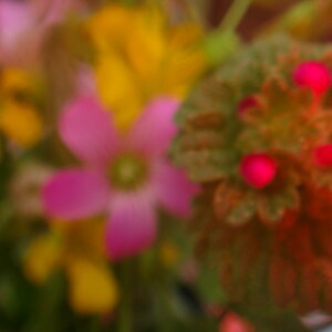
I have to second Linda, #1 is a fantastic shot. Rich, rich color, without being over saturated. I loce the contrast of the light and dark. Did you focus on the pistol/stamens? I like the blur in the rest of the shot. Still leaves enough detail. I just wish the subject was sharper.
#2. I am not a big fan of car shots. Not that I look at this like *ugh*, but I just don't know what to say. Compositionally, I think you should crop out the people, and the Audi sign. The bright white sign distracts from the "evil" emotional reaction you are trying to get out of me. I kind of like the "letterbox" with the dark bands on the top and bottom, but I feel the reflections on the bottom, are distracting. With the Audi sign and peoples, this just says "car show" snapshot to me.
#3. I wish you took the pic at a bit higher of an angle, to catch more hood, so you could lose some of that background.
I love #4. I like the angles from the reflected trees and the peninsula. The peninsula catches my eye with it's focus, and leads me to the trees, which lead me to the ice, and back to the peninsula. Nice. I like this as a B&W, but I don't get "Spring is here" at all. I get "cold". Nothing really indicates the coming warmth and rebirth spring brings. I'd like to see this in color, maybe under saturated to suggest the color a bit. Otherwise, I think this is a great image.
#4 is interesting. I didn't even really see the birds, though. I was caught up in how the buildings look piled on each other. The telephone pole is distracting to me. I think the right side of the pic is the strongest area.
I like the colors in #1. Tulips are one of my favorite flowers! However, I feel like the focus just isn't quite right. I like the exposure too, I feel it gives the photo a different "environment," if you will.
#2 doesn't do much for me. Maybe its a little underexposed? I do like how you caught the reflectors in the headlights, pretty cool.
Again, I love the colors in #3. Also, the little spotlights on the car from the lighting. It really gives it a neat feel.
#4 is my fav. I feel like there is a lot to look at and so many ways you can interpret it, but this doesn't take away from the picture itself. Great job.
I don't really like #5. I'm not really sure what I'm looking at, but like you said, if the focus were a little better, it would help.