Group 1 Rule of Thirds C&C

Sherman Banks

TPF Noob!
Joined
Feb 24, 2009
Messages
871
Reaction score
0
Location
Rain City
Can others edit my Photos
Photos OK to edit
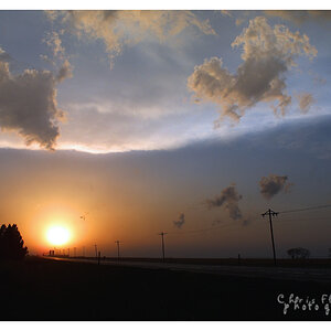
Here are two shots I did for the rule of thirds (if you're a contact on flickr, you've already seen them). My subjects aren't precisely where the 1/3 intersections meet but they're close.

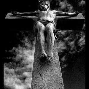
Very basic shot here. Didn't want to run and get the strobes so I did the classic silhouette effect. Pretty old school. Shot info here
3590819925_d913405a9d_o.jpg


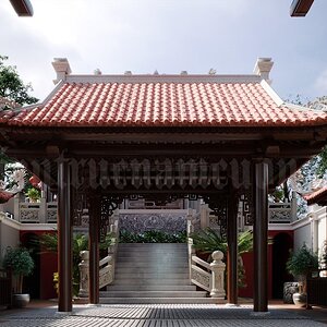
Not so basic in terms of getting the shot. Shot details can be found here. There is more room laterally than there should be for a strict following of the rule, but I like the wider crop better.

3588457212_2901170d7f_o.jpg


I usually try to keep some continuity to my shots so sorry for the completely unrelated photos.
 
i LOVE the skateboard shot's composition. i think the location of the guy is perfect. The first picture is ok, though the off-center location of the couple horizontally is kinda throwing me off.
 
I love the silhouette, the colors, the feeling. I can't figure out why compositionally, but I am repeatedly draw to the hands. I like the the proportions of the the sky, and black space.

Sk8r boi, I like the feel of this image. The image quality is hard and contrasty, which works so well with the subject expression, and the fell of the location. I think you should have more headroom. Can you explain your decision on that? As far as how much room you have laterally...I am torn. I like seeing the travel space, I like how the light falls off, and you have some subtle angles to lead the view back in. But I also see that nice shadow on the wall, that I think I lose a little bit more, than if it itself landed on a thirds division.

Both strong images, with strong emotional feel.
 
Thanks for the feedback guys! For the first shot, I tried to make it so the hands were at the intersecting points, but I was in the shot not behind the viewfinder so it's a little off.

The second is a bit different due to styling of skateboard photography. By having the tight crop on the top of the frame it makes the trick appear larger. It's the same concept if you took a shot of someone who was 4' tall. If you leave a lot of space in the top of the shot, it makes them look short, but closing the frame up makes them look larger. This is mostly to make my crappy skateboarding look better than it really is! As for the width, I like wide shots and I wanted to capture the light fall-off on the concrete (which in itself creates a line towards the subject). I can see how it may be too wide for some but I like the unbalanced feel that comes with it. I may try to revisit it to see what cutting down on the width will do to it. Who knows, maybe I'll love it.

Anyways, thanks again for the comments, I really appreciate it!
 
I'm pretty much a noob to photography, but the skateboard shot is great. I don't know if it is perfect, but it grabbed my attention better than anything I've seen tonight. John
 
Thanks John, I appreciate the compliment. It's definitely got its flaws. This was self shot so I had a whole host of issues while trying to get this timed right. I think I'll have my wife control the shutter next time!
 
I think your sunset shot would be better if the couple were closer, right now it seems forced, or staged. Maybe if you were holding each other around the waist, or head on shoulder kind of thing... Next time, try different angles and poses, keep the best ones.

Cheers,
Marc.
 
I think your sunset shot would be better if the couple were closer, right now it seems forced, or staged. Maybe if you were holding each other around the waist, or head on shoulder kind of thing... Next time, try different angles and poses, keep the best ones.

The shot is staged (that's me on the left). I tried a shot with both of us close and it just looked like a two-headed blob. I purposefully placed us apart so the emphasis would be on the connection of the hands, but I should've tried some different angles. Thanks for the advice!
 
The shot is staged (that's me on the left). I tried a shot with both of us close and it just looked like a two-headed blob. I purposefully placed us apart so the emphasis would be on the connection of the hands, but I should've tried some different angles.
I see. Well then, why not just a crop of the hands? I know you were working with the rule of thirds in mind, but what the heck! Rules are made to be broken! Ha! :D
 
this to me looks completely natural. I think the picture as is, sends a powerful message. If you two were not holding hands, it would look as though you were friends, maybe strangers. But, with the silhouette holding hands, I see two people in love enjoying a beautiful view.
 
this to me looks completely natural. I think the picture as is, sends a powerful message. If you two were not holding hands, it would look as though you were friends, maybe strangers. But, with the silhouette holding hands, I see two people in love enjoying a beautiful view.

Thanks Danny, that was exactly what I was trying to portray. Glad it translated that way to you.
 
Nice pictures, once again. Did you take any where you were facing each other? I like that the attention goes to the holding hands. I think it looks nice this way..just two friends enjoying the sunset. Technically, it's great. Clean, crisp image..the horizon line follows the rule of thrids nicely. The colors are beautiful and the lines are nice and straight. No complaints here.

In picture #2, I like the position of the skater (you). I think that it allows for the shadow of the skateboard to still have some room in the frame too. I hadn't questioned why so close to the top of the frame, but am glad that someone else did because I learned something new about this type of photography. That is a great point about making it appear as though the jump was much higher when you don't leave any more room for him (you) to go.

The only technicality I see is that the back arm is in the shadows. It would have been nice if it could have had a little more light on it, but no big deal because we can still see it's there. It looks like you were working with one light (yes?) Probably a second light would have completely changed the look of this image so don't listen to me..I don't know what I'm talking about :)
 
Thanks Linpelk! The second shot is actually done with two lights: one flash aimed down at the skateboard on camera left, and another flash shot through a beauty dish on high camera right. Without the secondary flash through the beauty dish, my whole upper body would be dark and only the feet and skateboard would be visible (which sounds like a cool shot now...). I tried my best to get my arm in the light but that hand has a tendency to go back like that and it's also holding the remote :). Thanks again everyone for your comments!
 
Thanks Linpelk! The second shot is actually done with two lights: one flash aimed down at the skateboard on camera left, and another flash shot through a beauty dish on high camera right. Without the secondary flash through the beauty dish, my whole upper body would be dark and only the feet and skateboard would be visible (which sounds like a cool shot now...). I tried my best to get my arm in the light but that hand has a tendency to go back like that and it's also holding the remote :). Thanks again everyone for your comments!

Ah, I see. That's how little I know about lighting!!
 
You don't always need thirds for a good photo. In the first shot the couple would look better centered I think, however the horizon is in the right place. The second shot is amazing the shadow makes it look like a pro photo.
 

Most reactions

Back
Top