grove

Alpha

Troll Extraordinaire
Joined
Mar 15, 2005
Messages
5,451
Reaction score
41
Location
San Francisco
Can others edit my Photos
Photos NOT OK to edit
grovefk1.jpg


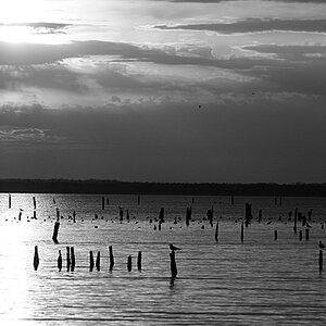
Shot on Foma 100. Printed on Ektalure G and gold-toned.
 
Looks good Max. I need to try more B&W.
 
I love the picture. I like how it drags you in.

The only thing I don't like is the area on the right. Looks like a hotspot to me. But Im not a pro.. this is my ametuer opinion.

All and all.. I really like the picture.
 
Could somebody move this to B&W, please?
 
At your service, sir!

I can - and did. :biggrin:

And like this photo!
I see the "blown" area on the right, too, same as Dianah, but I know too little about darkroom work and processing film to say much about it.
 
I concur (word of the day calender) with zendi--the blown area on the right's distracting, but I'm willing to bet it's part of the scan. Nice work, Max! Did you shoot this with your 4x5?
 
I think a vertical framing would have emphasized the pathway through the grove more, and also eliminated the hotspot. Beautiful tones. I'm sure the print glows.
 
well there's a good range of tones, but it looks quite soft all the way through the image to me and the blown area really pulls the eye away. I agree with Digital Matt a vertical comp would have avoided that.....maybe the softness is due to scanning?
 
Hi!

Nice dept of field in this one!
The overexposed part to the right is not quite distracting enough for me to be bothered about it! ;) (which is the first time)

I would choose for a different border though, this black one is way too heavy.

gr,
Roger
 
WHAT THE HELL!!!

GOLD TONED on Ektalure FRIGGN' G???

I'd really like to see, scratch that, HAVE a print of this.

I've heard old timers say, "When Kodak dropped Ektalure, I dropped Kodak"

Also, I'm reading complaints about the "blown out highlights, on this print"
I'd like to remark on that.

***note to pixelographers, when you see a nice digi-pic onscreen, you know that a print will almost always be slightly disappointing, right? How it doesn't quite "pop" like it did onscreen.

Well, it's much the same but opposite with optically produced prints in a chemical darkroom. You take a print that glows from within, think to yourself, "I can't wait to show this off online:mrgreen:!"

So you slap it on your flatbed, scan it, then take one look at how flat and lifeless it now looks and think..."Oh well...never mind":grumpy:.

The only good scans of prints use drum scanners that wet mount the print, and the only way to use one of those is to either be rich, or send it away to get it scanned, so you can put it up on your website to sell prints. most amateurs need not apply, because of cost.

What I'm trying to say, in my roundabout way, is that you really only get a taste, usually, from a scan of a print. You only get the composition. Upscale it in your mind, and remember that the blacks will show detail, and the whites will usually show detail on the print, that doesn't exist on the scan.***

Example, this is one of the better people pic's I took. I just happened across this couple, in the evening, as light was fading, on an overcast day.

On this print, you can actually see this man's fine white hairs on his head. ALL of them.
Here is a bit of the best scan I could take.
whitehairs.jpg

Notice that it just turns into a white blob.

So, since you can see some detail in the scan, you should definitely expect significant highlight detail in the actual print.
 
very slick.

i'd say i'd crop it or something, but i don't know HOW i would crop it.

blown highlights? psh, is it that big of a deal? its not like having a solid white kills a photo in every instance.
 
Thanks everyone for the comments. It was developed in TMAX developer. In retrospect, I might have developed in a staning developer to help control the highlights. Still not entirely sure though. The texture and tone of the paper does help a little, though.

Although it appears a little soft because of the scan, as far as I recall, the area to the right actually is partially blown out. As for whether it's distracting...perhaps. I don't find it overly so. I like the gradient of the woods thickening on the left to opening up on the right.

As for the vertical crop, I had tried/considered it, but decided that it made for too boring a composition. There just wasn't enough variation...no larger areas of shadow or highlight. It just made the tone range a little too narrow for my tastes.

As for the format, it's actually 35mm.
 
It's probably my screen, but your highlights/midtones look kinda flat and all gray. Your shadows are definitely black though.

I would love to see the print, I am sure it does it much more justice. As for the framing, I agree with Matt that it would be more pleasing if it were framed vertically.

It's a nice shot, none the less, and I like the converging lines and DOF.

Perhaps a slight burn on the right side could have controlled the blown out area.
 

Most reactions

New Topics

Back
Top