Guitars CC welcome

RichieT

No longer a newbie, moving up!
Joined
Jul 19, 2013
Messages
192
Reaction score
68
Location
New York
Can others edit my Photos
Photos OK to edit
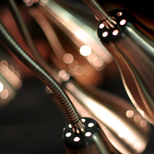
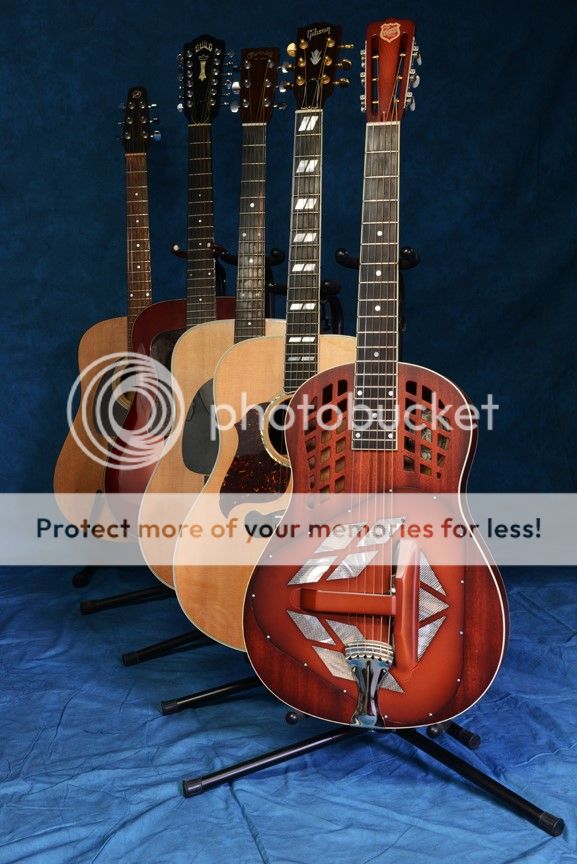
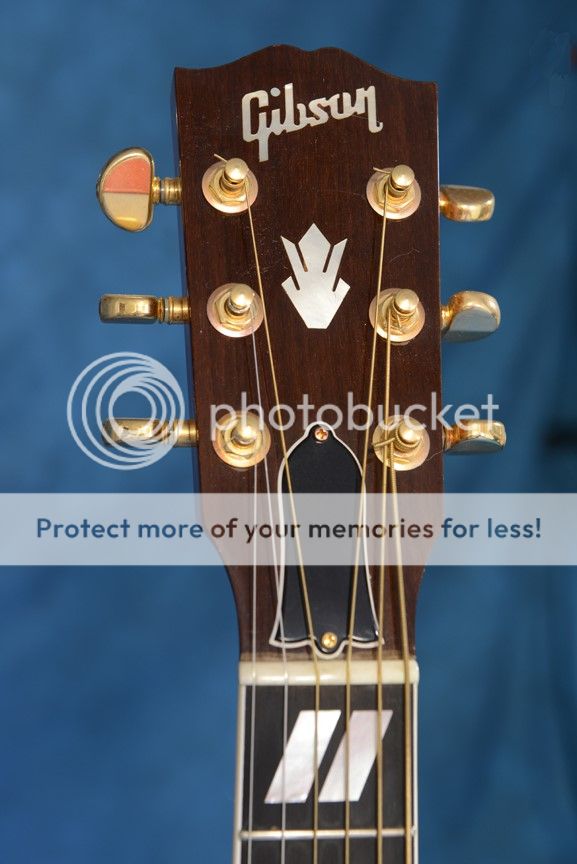
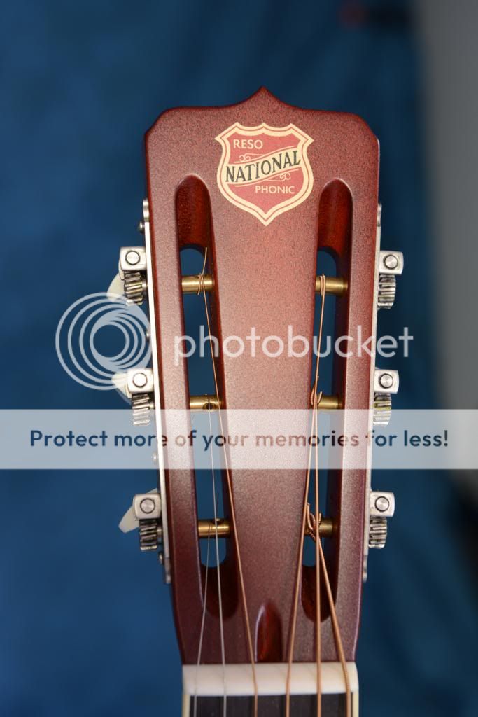
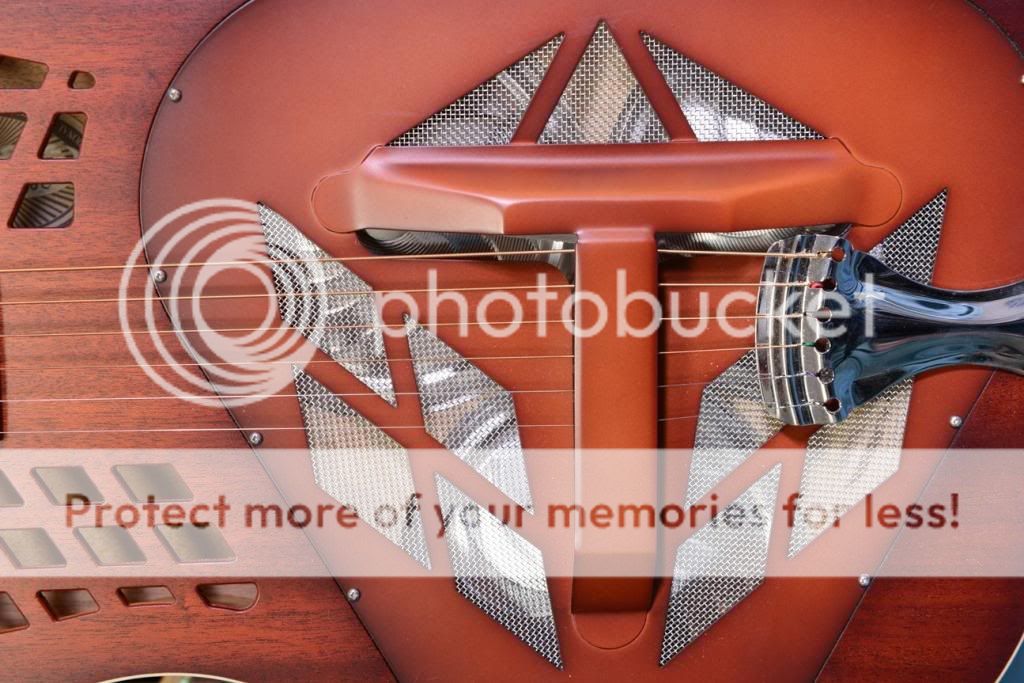
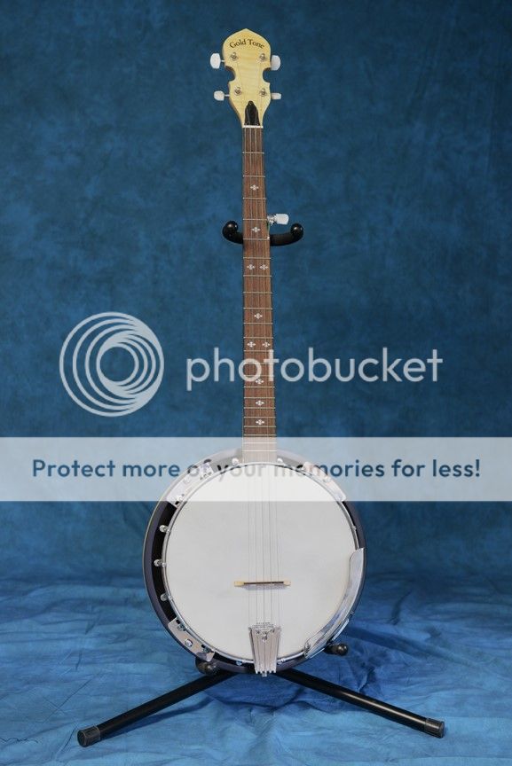
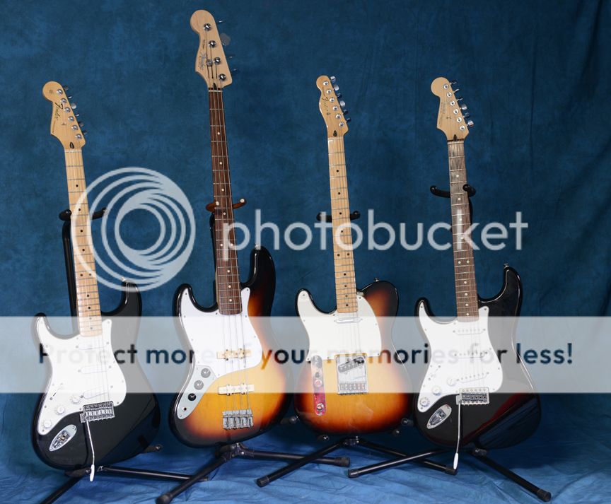
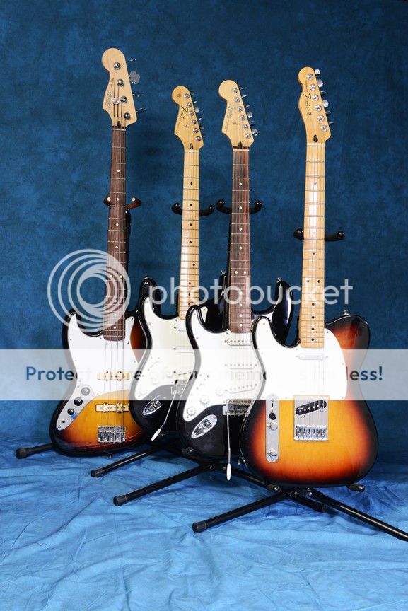
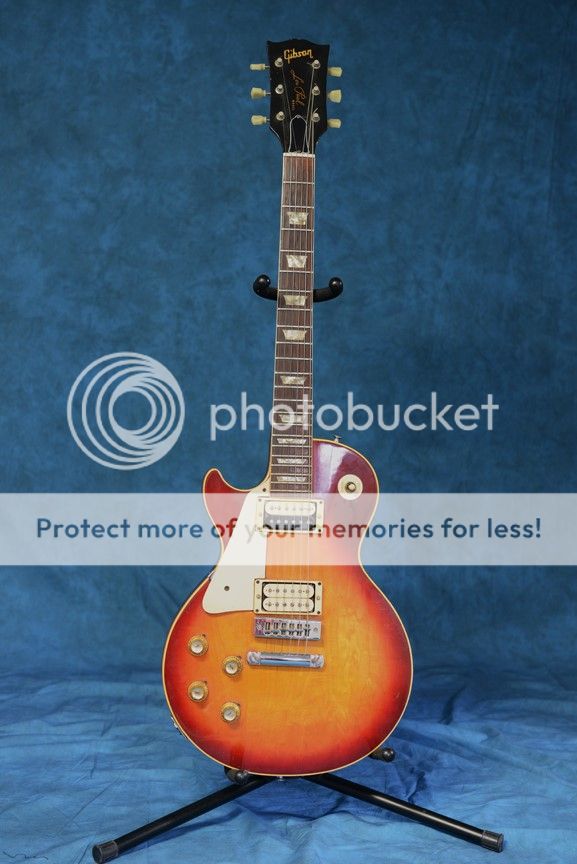
Hi all. I had a free Saturday so I decided to try some pictures of some of my guitars. I tried flash but had too much reflections and high lighted chrome. I then tried ambient lighting and a custom white balance. I blacked out the side window but left the rear window which I see still left some reflections. I also see (after the fact) I need to cover the red couch since that shows up nicely in the Strat. However, these pictures do nothing for me. I don't know what I'm missing here and any advice you can give me to help make them pop a little more would be greatly appreciated. Thanks.

1

3-29_025_zps1169adc6.jpg


2
3-29_037_zps4e08c214.jpg


3
3-29_038_zpsa780c3b7.jpg


4
3-29_040_zps486b486a.jpg


5
3-29_054_zps9d0beefd.jpg


6
3-29_041_zpsa14a2354.jpg


7
3-29_048_zps922a1dab.jpg


8
3-29_051_zpseaf30a4e.jpg
 

Attachments

  • $3-29_038_zpsa780c3b7.jpg
    $3-29_038_zpsa780c3b7.jpg
    63.3 KB · Views: 69
I think there are small aspects that can add value: backgrounds can be tidied up, e.g in #3, and more generally, if the material was pressed/uncreased. Images like 2,3: unless they're just for reference, they're a bit bland, partly because the item is placed so centrally. IMO, 1,4,(5) & 8 are more appealing; 8 with the nice sunburst colour, against the blue, (5 in a similar way); 4 is quite 'abstract' and interesting - cropped a bit from the right hand side, straighten a bit vertically would improve it. I like the light blue/dark blue background, due to the flash(?). Generally, imo, you need to get off the perpendicular with these - either in arrangement, (i.e #1) or camera POV. Apply the idea of #4 with pictures like #1 - and get closer/zoom in more.
 
Last edited:
..pictures like #6, but arranged in an arc/more of an arc, could be good; tighter cropping, and with a more off-center POV.
 
Thanks, You gave me a lot of good input. Yeah, the background in 3 slipped by me. I ironed the background before the pictures, it's new so the creases are pretty bad. I also steamed the top which worked pretty well but the bottom looks much worse in the pictures. So much for cutting corners. I agree that the headstocks are pretty bland. Thanks again.
 
What you're missing here is interest. Funk.

There is none. Just some guitars badly lined up. Even though the first one in line is quite beautiful.

Try harder

The most interesting image is #4. Because of the guitar, not your photography.

Learn how to place the objects in your photos, learn how to light, learn how to use the right background, etc.
 
I think trying to cram too much into one photo just detracts. Next time I'll try individual guitars and try to come up with some different angles. As I said, these pictures did nothing for me so I know there's vast room for improvement.
 
Yes there's huge room for improvement. But not because of the number of instruments. It's your photography and you can learn if you can be real about the problem.
 

Most reactions

New Topics

Back
Top