vipgraphx
No longer a newbie, moving up!
- Joined
- Dec 1, 2011
- Messages
- 2,415
- Reaction score
- 440
- Location
- Some Where In the Desert
- Can others edit my Photos
- Photos OK to edit
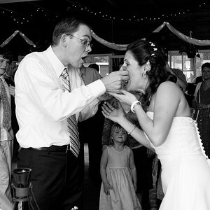
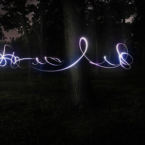
Thought I would ask what your thoughts were on this photo. Any feedback appreciated

high contrast by VIPGraphX, on Flickr
high contrast by VIPGraphX, on Flickr
") good work!
good work!


![[No title]](/data/xfmg/thumbnail/31/31977-2b717e032201241cbeae8226af23eba4.jpg?1619735136)
![[No title]](/data/xfmg/thumbnail/31/31979-ea92aca54ae865842d998c9cec534991.jpg?1619735137)