Heartpatrick Portraits - Ian Chung

heartpatrick

No longer a newbie, moving up!
Joined
Aug 30, 2006
Messages
226
Reaction score
61
Location
Kuala Lumpur, Malaysia
Website
www.heartpatrick.com
Hi All,

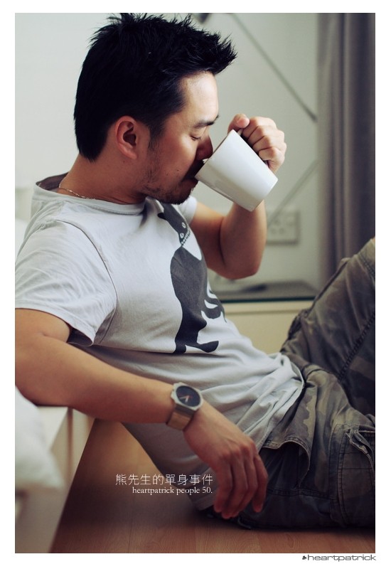
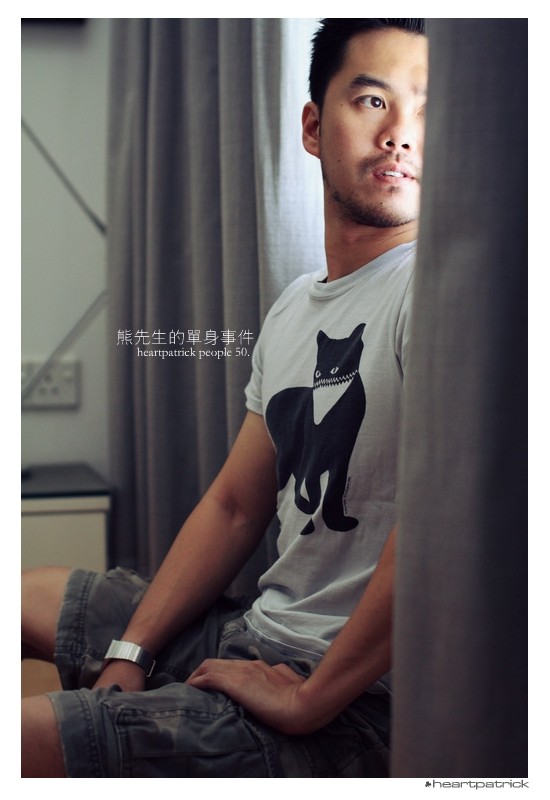
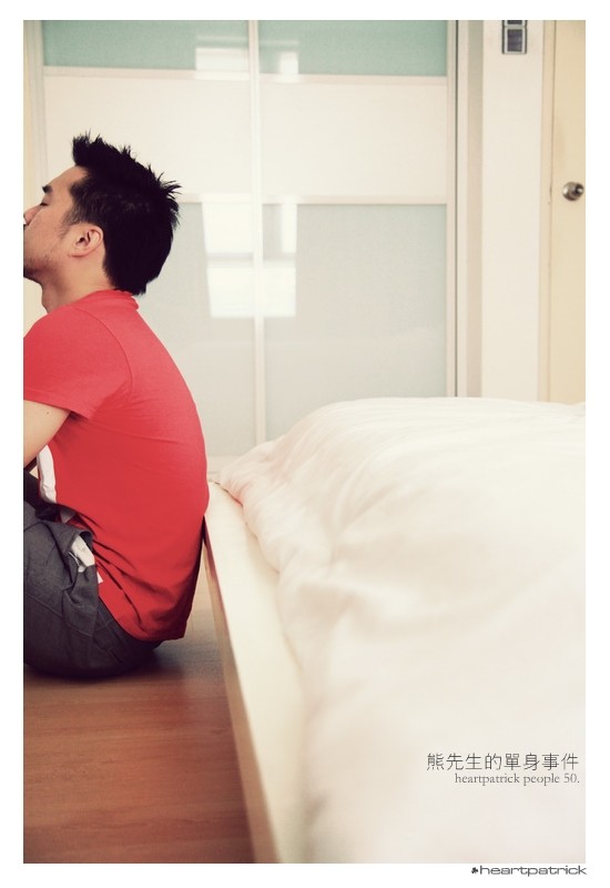
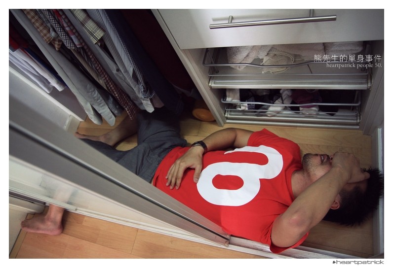
Sharing some shots from a recent indoor portrait shoot:

Pic 1:
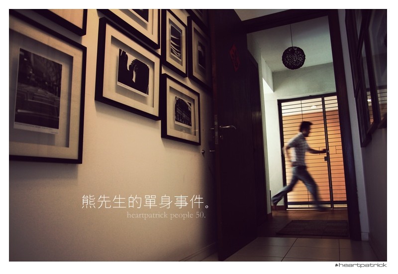
01.jpg


Pic 2:
10.jpg


Pic 3:
12.jpg


Pic 4:
24.jpg


Pic 5:
25.jpg


Pic 6:
30.jpg


Pic 7:
31.jpg


Pic 8:
38.jpg


The full album is available here:
Heartpatrick - People - Ian Chung in 熊先生的单身事件


Thanks all.


Regards,
Pat
Heartpatrick: Malaysia and Singapore Wedding Photographer
 
Great stuff Pat! Love the colours and composition consistency through out the entire series, really makes it one whole thing!

Love the lighting and creative framing.

Nice one!
 
Really interesting use of colors and window light. Good job.
 
#1: not feeling the composition, but that's my opinion, others seem to like it.
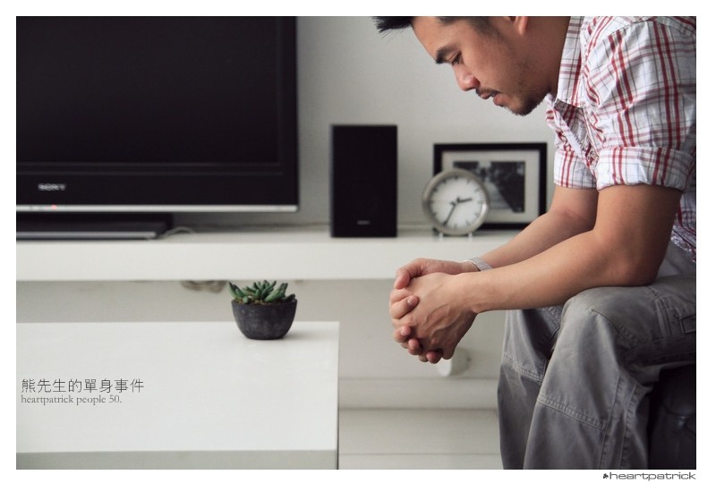
#2: I do like this one, but don't like that his elbow is cut off. Finish it -_-
#3: another one i would've liked more, if that curtain wasn't barring half of his face. I do enjoy the light hitting his face, though.
#4 would've been my favorite if he wasn't cut off.
#5: It appears to be more of a snapshotty type of photo, I'm on the fence about the composition..
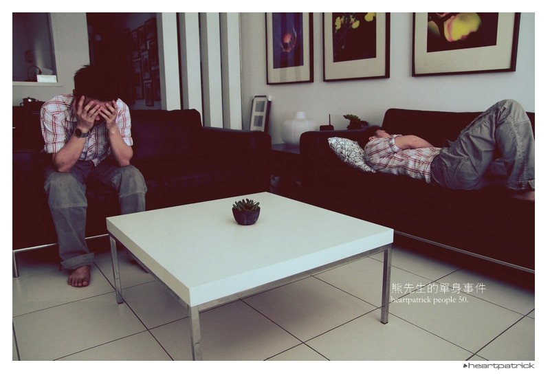
#6: I usually like milky tones but I'm not sure if I like it for this particular photo. I think it's the dark couches that make it uncomfortable for the eye to look at? There's also a greenish cast to it, not sure if this was intentional.
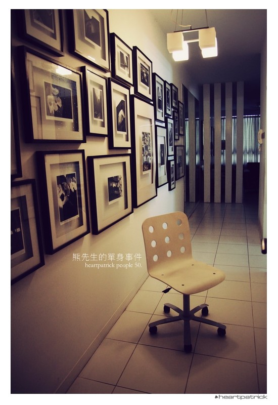
#7: Good photo, I would've taken a step or two back to do away with sacrificing the top of his head.
#8: Nice! I would've cropped the right a bit.
 
Last edited:
#1: not feeling the composition, but that's my opinion, others seem to like it.
#2: I do like this one, but don't like that his elbow is cut off. Finish it -_-
#3: another one i would've liked more, if that curtain wasn't barring half of his face. I do enjoy the light hitting his face, though.
#4 would've been my favorite if he wasn't cut off.
#5: It appears to be more of a snapshotty type of photo, I'm on the fence about the composition..
#6: I usually like milky tones but I'm not sure if I like it for this particular photo. I think it's the dark couches that make it uncomfortable for the eye to look at? There's also a greenish cast to it, not sure if this was intentional.
#7: Good photo, I would've taken a step or two back to do away with sacrificing the top of his head.
#8: Nice! I would've cropped the right a bit.

We must be telekinetic or something... I was scrolling down to start writing almost exactly this, and then I read your post. Way to beat me to the punch :[
:lmao::pwe just have good taste :thumbup::mrgreen:
 
We must be telekinetic or something...

Sry to be a complete geek but thats when you can 'move things' with your mind, the one your looking for is telepathic :mrgreen:

:lmao::pwe just have good taste :thumbup::mrgreen:

I would go for 'similar' rather than 'good'...
Personally i like all the things people would usually point out as being wrong.
#4 for example is intentionally framed that way to show a more distinctive style.... its not really like he didn't realize he had cut his head off :sexywink:

I just get bored of the same ol' compositions, which is what drew me to comment on this thread... if everyone shot the same way the world would be in danger of becoming a bit uniform :p
 
:( I have bad allergies right now and my geek-think is all out of whack today ok? lol.
 
I like #6 the best. Probably because it's the only one where he seems to be the focus of the photo. In most of the others, it looks like you were taking a picture of the area and he just accidentally got caught in the shot.
 

Most reactions

Back
Top