Help with site

First of all, I applaud you for NOT using Flash, but your home page? In a word, "Ouch!". Wayyyy too busy.

Your home page should set the tone for your 'site. Keep it neat and clean, one or two of your BEST images, a basic blurb about who/what you are and the type of work you do, and some straight-forward navigation links. (Note, you don't have a 'Home' button on your bio page).

As well, the spelling/grammar are lacking, and this projects a very unprofessional image of your abilities. "If he can't spell well, why should I think he can photography well?". Referring to yourself in the third-person is a personal preference, but IMO, "David this" and "David that" are not nearly as personal and engaging as "I this" "I that".

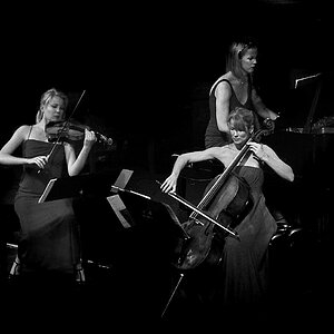
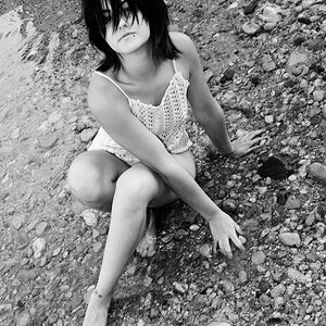
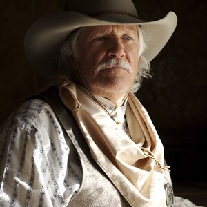
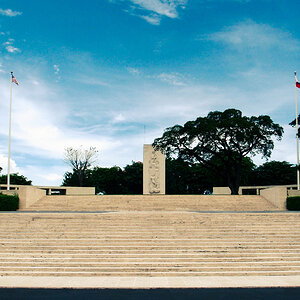
Lastly is your choice of photographs. While I'm a huge fan of B&W, I think you have a bit too much of it. It's much better to showcase twenty top-notich images than 200 mediocre ones.
 
Many, many people still use monitors that display a 1024x768 resolution or less.

For those people, they will not see your entire page on thir monitor.
 
agreed, 1024x768 is probably the best. its what i use on websites, and about 70% of the viewers of all my sites use this size.

i also find it too busy. i like to have the navigation links arranged neatly in one spot, down the left hand side for example. i personally find it too distracting and hassle to zig zag left to right when reading.

if it were me, to be honest, i would probably have the left hand nav with the image links (previous work/contact etc) and have all your writeups/pics in the center

also, probably more of a personal pref. but i dont like those kinds of div blocks to be fixed, makes different screen sizes difficult to get right. it can work ok, but i find it more time consuming....call me old fashioned, but for a basic site like this i like tables...much easier and FASTER.

lastly, i would work on the logo/banner. i can visualize a pretty sweet logo using the "kassil Photo" oval, and ditching the grey...that big grey rectangle draws away from your work i find, despite kind of matching the B&W.

great start though :) if you are interested i can send ya over an example of what i mean on the layout.
 
Thanks for everyone's comments so far. This is my first attempt and taking everything that is said as a learning experience.
 
Looking at your metadata I'd also recommend investigating SEO (Search Engine Optimization).
 

Most reactions

New Topics

Back
Top