Here we Go....

mwild

No longer a newbie, moving up!
Joined
Sep 24, 2012
Messages
140
Reaction score
41
Location
Alberta, Canada
Can others edit my Photos
Photos NOT OK to edit
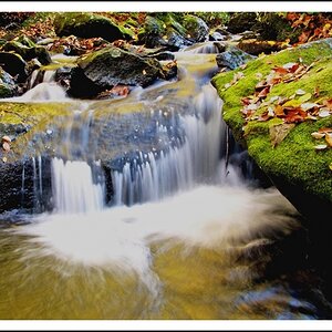
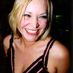
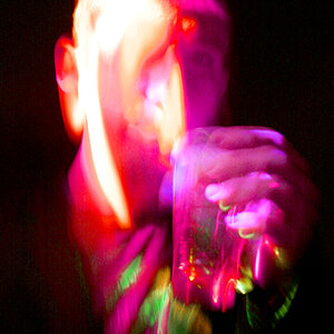
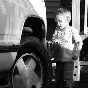
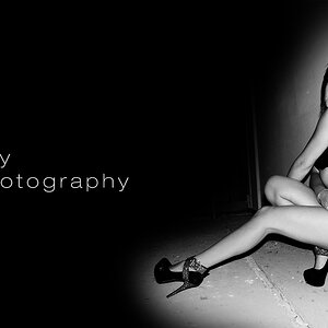
I just recently took the dive into taking my photography to a professional level.

I have created a website and have started marketing my work. I'm currently working on a logo, and I'm on a never-ending mission to perfect my work. It's very important to me to give my clients quality work so I feel I need to keep improving.

Here's my website: Melanie Wild Photography

Constructive criticism is appreciated. Thanks so much guys. :)
 
'Site C&C per req:

A few thoughts... 'About': I think one image of you is enough; three seems a bt egotistical IMO, but if you do want three, I would sort out the WB of the middle image; your skin is green in that one. I would also avoid the use of the third person; it tends to separate you from your potential clients, whereas first person generally implies a friendlier, closer feeling.

'Contact': Change your e-mail address to your domain; nothing screams 'amateur' like a free webmail address. This might be a place to put one of the images from your 'About' page as 'Contact' is rather plain.

Your portrait images are nicely done, although there are a couple (notably the one of the young lady in the open-front red and white checked shirt sitting on the hillside) which don't seem to fit styalistically with the majority. I would also suggest for this sort of portfolio only having a single image of a given subject UNLESS the poses/look is markedly different. I did note that a number of the images under your lifestyle/Travel gallery that need reworking; tilted horizons being the biggest issue.

Overall the 'site is nicely laid out, quick, and responsive.

Just my $00.02 worth - your mileage may vary.

~John
 
Thanks so much John! Your feedback is very much appreciated and noted. It's stuff like that, that I love to hear!
 
Little things:
1. email address isn't a link. would need to copy paste if I wanted to reply.
2. include fillable form on contact page.
3. need more blog content
4. fix email address like was mentioned
5. Think about merging contact and about sections. Not enough to justify two pages.
6. The phone/tablet version is a bit of a mess.

Big Things:
1. I don't know what you are selling here. Is this a portfolio site or a sales site? You need to sharpen your focus on your target market. If you are only looking for wedding work cut everything else out and so on.
2. The landing page photos are the same as the wedding section. If you are trying to go after multiple market than that needs to show more range. I would only have a max of 8-10 photos on this page and they need to be the BEST you have.
3. I think the rotator you have on the home page is good but on the secondary page I think you'd be better off with a gallery that has thumbnails for quicker navigation. I can tell you already that most people won't get past 8-10 images before losing interest. Also with thumbnails it would allow people to jump around to images they are interested in.
4. You have ZERO SEO going on. No pages descriptions, no meta data, and very little text. All of these things get your site more visible.
 
I agree about the three photos of yourself — I'm not really bothered by the fact that there are 3, but they could definitely be better arranged and resized on the page. That vertical photo is huuuuuge.

The layout looks nice, but like runnah noted there doesn't seem to be any on page SEO going on. Great photos appeal to humans, but search engines can't tell a great photo from a mediocre one. I don't know what SEO options squarspace gives you, but I'm sure they must have some way to add things like descriptions and alt tags.
 

Most reactions

New Topics

Back
Top