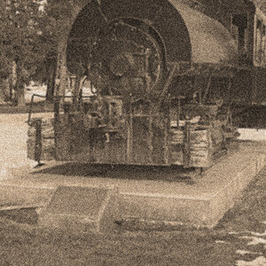
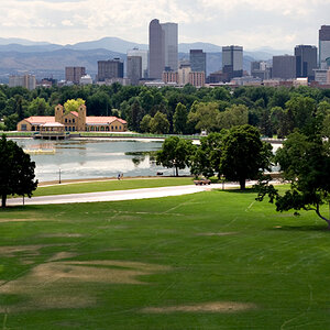
this was a night shot, DUH, that i converted. two things: i'm not sure about the tones and second, i'm wondering about the inclusion of the wall on the right. whatcha thinkin?
As for the wall... that's a tuffy because if you were to crop it you would get a nice smooth profile of the curve but then again if you leave it.... talk about throw a curveball!
I think the wall is a nice counterpoint to the sweep of the center section. Without the strong vertical I think the picture would end up looking like an unfinished statement. Tonality is just fine, brings out the texture nicely in the vertical which acts as a good contrast to the curved part. You might try lightening the walkway on the left just a tad
A very nice shot. And I actually like the wall on the right very much. To me it gives the eye a calm point to start from and return to without drawing too much attention on it. Very good.
I love the subtle horizon (treeline)! I think the tones are fine too.
I understand the struggle about the foreground wall. You really need it to communicate the shape of the wall. Did you try burning in the lower corner a bit? Not so much that it would match the top portion, but just a bit.
I like the tones in this ... but I am going to go against the grain here and say that I think I'd prefer to see this shot without the wall in the foreground. This shot has so many nice curves with the wall,the inground lights following the curve of the wall, the reflection of the wall and even the curves of the wall in the rear on the right. The wall just seems too harsh and to me doesn't seem to fit. Though I suppose that might be the appeal of it to some
No seriously. I think in this case the wall helps define and end of the curve part. I would use it.
As far as tones, I think its pretty much there. The only thing I would try maybe is to bump contrast a touch for more graphic feel. Just an idea, not saying it needs it.
I agree with a lot of what was said. Tones look good, etc. I did a little crop experimenting with my monitor and I think the wall does add something, but I think I'd crop out about half of it. It feels like there is a little too much now, but if you lose it completely, I think you lose some of the context of the photo.
I am brand spanking new here, you are my very first! I do like the shot, it seems a bit eerie to me, eerie in a good way! If all the posts are this good, I'll be spending all day here! :cheers:
I think I'm gonna have to vote for the first on this. The cropped version leaves an unsettling feeling IMO, but the first feels complete...I think the wall adds to the movement. The tones also work well IMO. In the second, something just seems missing...


")