HeldInTheMoment
No longer a newbie, moving up!
- Joined
- Jul 27, 2015
- Messages
- 297
- Reaction score
- 33
- Location
- Vermont, USA
- Can others edit my Photos
- Photos OK to edit
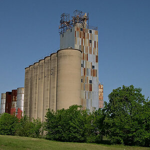
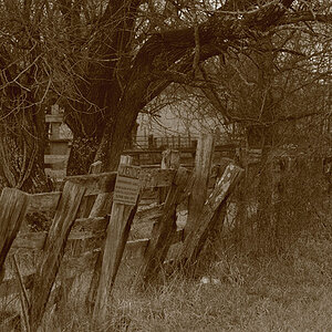
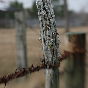
As the title says, I am looking for honest feedback and critiques please. You can't hurt my feelings, if I want to grow as a photographer, mistakes will be made.
Thanks!
-Jake

Thanks!
-Jake