Honest Opinion

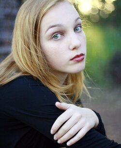
Why is presenting a hand unflattering? Is it? She has nice hands, slim fingers...

Hands are o.k., just that this particular pose shows the hand very prominently, nearly the same size as her face, therefore competing with her face.

I am not aware of any "rule", just my own observation.
 
i have fixed up the two images

1. $_MG_8454.jpg

2. $_MG_6923.jpg
 
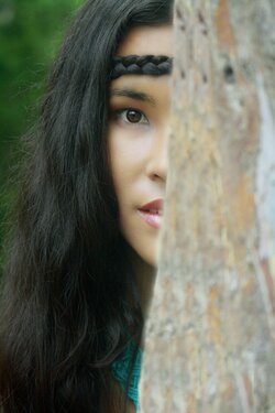
Number 1 suffers from brain amputation, an amputated elbow and skin that is too pale, washed out?, and losing detail. The bright flares in the background are also distracting. In the second one, a blurred foreground is generally avoided by almost all portrait photographers.
 
Agree with Cowgirl too, #1 just doesn't look right with the color, #2, is just not composed right to be awesome.
 
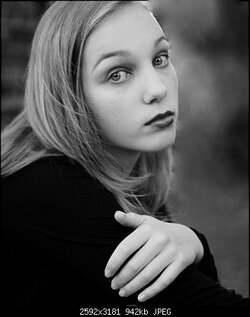
I was playing with it a bit with a B&W copy.I removed the bright bokeh and some of the fly away hair. I brought down the exposure a notch and up on the contrast very little and got this. I have very little experience with this so was just a shot.
 

Attachments

  • $_MG_8454.jpg
    $_MG_8454.jpg
    35 KB · Views: 74
Last edited:
Am I the only person who thinks she missed the focus on #1? It seems to be on her hand no? Possibly just the one side of her face. The other is too OOF.

I like #2 though.
 
Am I the only person who thinks she missed the focus on #1? It seems to be on her hand no? Possibly just the one side of her face. The other is too OOF..

Looking at it closely you are correct. The focus is more in her shoulder area than on her face. Her hand is washed out somewhat so it is hard to tell focus in that area.
 
C&C per request:

1) A few of the technical issues have been bludgeoned to death (white balance, focus), no need to rehash them. I do like the composition, and I don't mind the hand placement. Had the back of the hand been square to the camera it likely would have been too large a portion of the shot. But IMO because the fingers have small gaps between them to break up the skin area, the hand is not a large, distracting single feature. And I think that showing the fingers curled around the arm works very well with the emotion shown in her face. I quite like her hair - whether by accident or intent you've both framed her face and defined her back/tied her into the left edge of the frame.

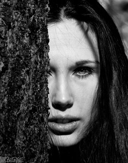
2) I'm not against out of focus foreground elements as a rule, I think a few branches or some long grass can help set the scene. But this tree is such a large block and a large portion of the frame that I don't think it works here. I do however like how much her hair wraps around toward the front of her face and helps hide it - a nice parallel to the tree. I had to go back and reread your original post to remember if this was a portrait assignment or not. As a standalone image I rather like it, it tells a story to me. But as a portrait I agree that not enough of her face is shown. Just for comparison, here is a similar shot I took a few years ago:
$AL_100109_0073_BW_WS.jpg
I'm not saying mine is any better, just that it has more of her face showing, and that the foreground tree is also in focus.

(Note: I am not looking to derail the OP's thread, so please don't critique this image here. Just offering it up as comparison to help visualize the points I and others have made.)
 

Most reactions

New Topics

Back
Top