Horse

Relic123

TPF Noob!
Joined
Jun 10, 2007
Messages
28
Reaction score
0
Can others edit my Photos
Photos OK to edit
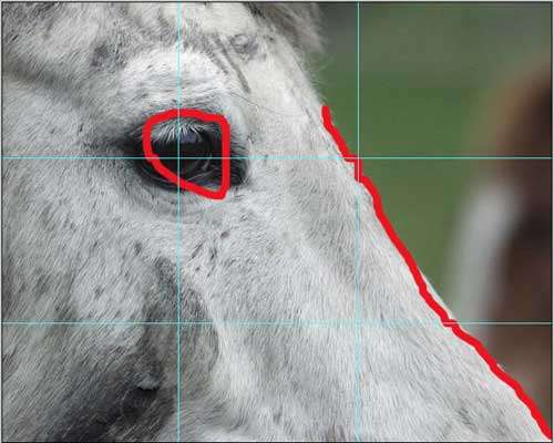
This is of a friends horse I took walking around after a rainy day, I like the style and look of this shot but I think there is "to much" horse in the left side of the frame. Should I crop it or leave it? Any critique would be helpful. Settings [ Canon Mark II N, Canon 70-200 f/2.8 IS L,1/800 Shutter speed, f/6.3, 1250 iso, 200mm setting, Exposure Manual]
SM1N0449.jpg
 
Crop it...down to what? The eye?
 
I think you're correct that there is too much 'horse', it is super-sharp and might be a much better graphic when cropped.

How about this?

horseox7.jpg
 
I like the edit, but I might not have cropped that much, personal opinion I suppose but I like it none the less.
 
Let me explain why I cropped it that way.
1) I usually crop to standard dimensions.
2) Large sections of HORSE are sort of boring
3) I wanted to turn it more of a graphic image then a representational image.

So I cropped the image so that the eye was in the strong 'thirds' position and that the intersection between background and horse came out of the corner. That requires the viewer to parse this as both a graphic image and a picture of a horse - and, I hope, make it more interesting by making the horse and his/her eye, part of a design.

horsedefre5.jpg

good crop... what did you use to make the thirds show up on your screen? is it an option in PS???
 
I think mr. traveler probably just used a screen capture to show his example.
 
I cheated a little by resizing the image until its dimensions were easily divided into thirds, pulled the rulers over into place on the thirds and then grabbed the picture from the screen with Snagit.

Then saved the clip as a jpg. Opened it in PS, drew on it with the brush et voila!

(my motto is: Never do anything the easy, obvious way if I can figure out a complex way of doing it that takes more time and effort.)
 
That is very impressive. I like the crop and the thought that went into it. You are obviously way above my level because I never would have thought of it in those terms.
 
You are obviously way above my level because I never would have thought of it in those terms.

Not so!!

What you need to do is abstract yourself from ownership of the image and start looking at it in other ways - but in some orderly manner.

Have a read here for a simple essay on critique.
http://photoinf.com/Golden_Mean/Michael_Fodor/Photo_School_-_Compsition_Basics.htm

After a while, all of (or most of) these issues will come together and you will begin to 'see' the picture.

I admit that I am prejudiced towards images with strong graphic content and simple bold colors - and it is easier for me to make some sense out of them then, say, portraits. With a portrait, I know what I like, but I often don't know why. (and most landscapes just bore me to sleep)
 
Im sorry but I hate this crop. I cant tell what the heck it is, way too tight. Looks like a really hairy white back, with a huge mole where the eye is lol.
 
Im sorry but I hate this crop. I cant tell what the heck it is, way too tight. Looks like a really hairy white back, with a huge mole where the eye is lol.

I was thinking 'albino moose.'
 
I'm going to have to agree with some of the people here, that the shot it's self leaves a little too much to the imagination. But If I was going to do something with it, I wouldn't crop anymore.

I think color does very little for the mostly monochrome horse. So I turned it to black and white (60% red, 40% green channel). I used the unsharp mask and smart sharpening to bring out a little more texture. I also tweaked levels a bit to give the eye more detail.

596108131_c7483324fe_o.jpg
 
That edit looks better, but I still find that I cant tell what it is without seeing the snout(I think its called a snout?), the mouth area.
 

Most reactions

Back
Top